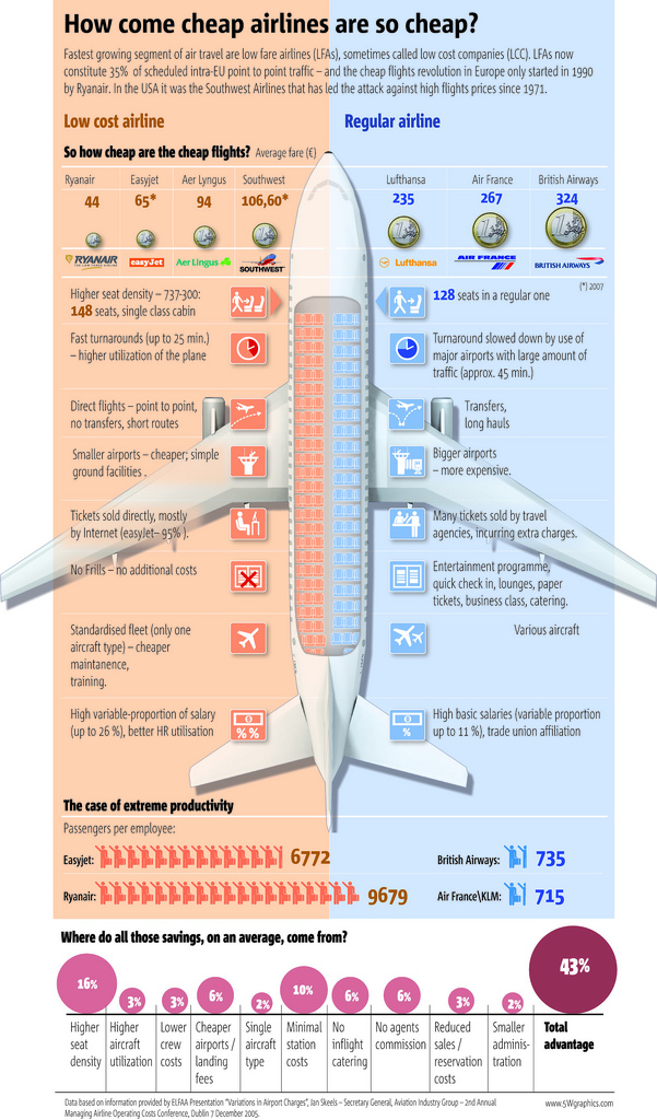
5W Graphics, whose work you’ve seen by now, compares lower-cost airlines to “regular” airlines. The infographic is from the Spain group, so the focus is on Eurpoean airlines. Apparently the concept of low fair airlines (LFAs) is fairly new in Europe, only starting in 1990 with Ryanair while Southwest Airlines was founded in 1970. I’m more of a JetBlue guy myself. I cherish my legroom and in-flight entertainment.
[via Cool Infographics]
 Visualize This: The FlowingData Guide to Design, Visualization, and Statistics (2nd Edition)
Seems like common-sense to me. And even if one were to throw in the comfort of a Jet Blue, the better management techniques used by “low-cost” carriers make them industry killers.
Pingback: Why European Airlines are so cheap? « Datarati :: Will Scully-Power :: Data, Analytics & Optimisation in the World of Advertising!
Some of this seems counterintuitive to me.
First, shorter flights means the fixed costs (paying the driver of the refueling vehicle, for example) are spread out over less miles of travel.
Second, for size of airport, why is it necessarily that “Bigger airports” means “more expensive”? I would think economies of scale would come into play here, right?
Have a look at this related graphic…
I like the idea behind the graphic; two tone color contrast, comparison of the two, use of the airplane overhead seat picture – a picture everyone can relate to.
The part that irks me is part below the plane.
“Where do all the savings…” – I assume they are referring to the ticket price.
The assumption is that each of those items is the same in so manners e.g. cost and margin to the company, value to the consumer, ease of savings and so on.
I can’t do anything about where they save their money nor does each carrier save the same amount nor can I tell how they did it e.g. how much higher seat density.
I would have much rather seen percentage breakdowns in the pie chart so as know where the companies are cutting corners. It seems like a very nice graphic was cheapened (pun intended) for the sake of having numbers on it.
The Infographic has a misquote – LCC stands for Low Cost Carriers.
Oh, and also – most LCC’s stay afloat by relying heavily on ancillary revenue (which is not mentioned at all in the graphic – only hinted at under “no-frills”).
Since you are using Ryan as the cheapest example, the graphic needs to be reworked to make the point of ancillary revenue (AR). Ryan would like to get to the point where their fare is 0, but they make it up (and then some) in AR.
You can’t talk about LCCs without noting their reliance on AR.
But this is leaving out the extra costs to consumers—getting to these small out-of-the-way airports IS NOT CHEAP.
Also it’s not fun being in one big flying ad-mobile–anyone flown JetBlue recently?
I fly JetBlue from Chicago to Long Beach every time I go to the west coast.
As for as being an admobile, I’m not sure what you mean. They have a couple channels on their TVs that are pretty ad-heavy, but you don’t have to watch them. It’s not like they obscure part of the screen.
As for the smaller airports, they still fly to major cities. My family lives in the San Gabriel Valley. Flying into Long Beach is a FEATURE, not a bug. It’s about 100 times easier to navigate than LAX, and the traffic isn’t nearly as bad. For people that live in Simi Valley, yeah, it’s a problem, but oh well.
A free round trip ticket for every nine one way tickets I buy is fairly reasonable as well.
My only problem with Jet Blue is that they only offer one flight each way per day between Chicago and Long Beach, so I take my chances on the Chicago weather. Other than that, a bad experience on Jet Blue is still usually better than a good experience on most major carriers.
You can’t call this a serious infographic, because the info part of it is just shite. For instance:
• Average fare : Average advertised fare? Average paid fare? Over what distance? Over what time period? (Easyjet and Southwest figures from 2007, for crying out loud. That might as well be from last century, given this is a competitive fast moving industry. The world economic situation has changed, but this graphic asks us to compare 2007 prices against some other unstated mystery time frame. No thanks, I think I’ll use Google to compare, and then I’ll check the terms of carraige and the addon costs. The link that Edward posted above is a great start.
• Higher seat density: If I fly coach class in British Airlines, do I really care that first class passengers have more legroom than me, thus giving all passengers – on average – more space? Yeah, right! What’s important is the density in the class I fly in…does this figure report that? Dunno!
• Fast turnaround/direct flights/ smaller airports etc: Where’s something showing whether the airlines on the left actually have any higher instances of these than those on the right?
• Plane graphic: This takes up a huge amount of space, yet what does it add in terms of information? Zip. Might as well have a photo of an elephant with big ears there.
• The case of extreme profitability: Last time I looked, people weren’t trading shares in these companies based on some crock metric like ‘Passengers per Employee’! What counts as an employee? Are many employee jobs in one airline carried out by a contractor at another? Do they pay those contractors?
It’s simply not good enough that this is “a picture everyone can relate to”. It’s supposed to be an INFO graphic.
Instead, we’re left with ‘just a graphic’, and as ‘just a graphic’, it’s a pretty uninteresting one, but I’m sure it more than adequately fulfils it’s task of taking up space in some mediocre publication somewhere…
THere is a great comment over at http://www.juiceanalytics.com/writing/think-designer/:
Before you discount design as a concept for well, you know, “those artsy types”, keep in mind design is… crafting communications to answer audience needs in the most effective way.What this means is that the more you focus on design, the more you’ll “speak” to your audience – which means you’ll be more effective with your data presentation. It’s about the audience, not you.”
Pingback: Ryanair y Easyjet no son más baratas — es.acuteaccent.com
The graph contradicts its title: the airlines are not cheaper, you just pay for what you get. Less money in absolute terms in exchange of more inconvenience.
The problem of British Airways and the other legacy monopolies is that they are massively overpriced beyond their value.
Nice graphic – interesting subject matter.
Could be improved by using bars rather than circles (and coins) in the comparisons charts.
Pingback: Why Are Cheap Airlines So Cheap? | FlowingData | Are Why
Pingback: Why Are Low-Cost Airlines So Cheap? « mere pixels
This has already been mentioned, but I thought I’d pass along my experience having just returned from a 3 week tour of Western Europe. On my trip I flew 8 legs from San Diego to Philly to Shannon, Dublin to Heathrow, Luton to Charles De Gaulle, Orly to Barcelona to Lisbon to Philly to San Diego. I may have saved money flying Easyjet from Luton to CDG and Vueling (a discount Spanish carrier) to BCN, but whatever savings I enjoyed in my ticket price quickly vanished in the costs I incurred trying to get to the more remote airports both monetarily and in terms of time and convenience as both Orly (and Luton especially) are more difficult and expensive to get to than CDG or Heathrow. Add the facts that I had to purchase food for these legs (and on the cross country legs to and from Philly on US Air, apparently flying across the continental US is no longer reason enough to warrant even a free packet of peanuts these days) and the inconveniences of flying out of a regional airport (no wireless Internet, longer lines to check in, fewer resources: my wife and I sat on the floor of Luton for over an hour due to the lack of seats) and the advantages of the major carriers are quickly revealed. I am of the opinion that aside from standardizing fleets and utilizing technology more effectively these “discount” carriers are simply informally passing along costs to their patrons more than actually saving them money.
Just one small question :
44 € + 40 % doesn’t make the 200 € cost of expensive company.
Is it because they have such a huge margin, or there is something not taken into account in the visualization ?
Pingback: onlain » Blog Archive » Por qué las aerolÃneas económicas son baratas, en infografÃa
Pingback: Medialandschap - Trends, kunst, media, lifestyle en techniek » Waarom Easyjet veel goedkoper kan zijn dan KLM
Pingback: ì €ê°€ í•ê³µì‚¬ ê²½ìŸë ¥ì˜ 비밀 « Creativity, Innovation, and Tech – 변지ì„
Hmmm… Absolutely no mention of Southwest Airline’s fuel contracts that have kept their fuel prices consistent — and much lower than their competition.
Pingback: Το Top 5 της εβδομάδας (09 ΑυγοÏστου – 15 ΑυγοÏστου 2009) | Newsfilter
It’s also leaving out the fact that most of the legacy carriers (Delta, United, USAirways) also have more experienced pilots and crews. So yes, you do sometimes pay a bit more for their salaries (which have taken major hits since even before 9/11 — sometimes up to 50%), but I honestly feel safer having someone behind the controls with 20 years of experience versus crews with only 2 or 3.