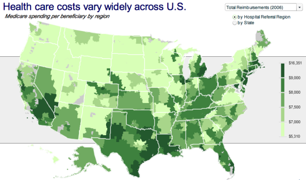
No, this isn’t a bad fungus spreading northwest towards Washington. This map from the Robert Wood Johnson Foundation (via MSNBC) shows health care costs across the country, and yes, you are included Hawaii and Alaska.
As you can see health care costs are from uniform country-wide.
However, the color scale is kind of funky. I’m guessing it was automatically chosen by the mapping software to even split the number of regions amongst the five color bins, which I think kind of throws off the color distribution. I don’t know. I think as a whole, the map is missing some special sauce.
[Thanks, Christopher]
 Visualize This: The FlowingData Guide to Design, Visualization, and Statistics (2nd Edition)
I found this is a really effective use of interactive mapping. Lots of information neatly presented. Any info on what software was used to develop and publish it?
If I were to guess, I’d say mapping in ArcGIS and then an import into Flex.
I would probably prefer if the (lightness/luminance/value) were proportional to the health care cost. The color difference at 7000/7500 is similar to the difference at 9000/16000, even though the price difference is much smaller.
I like Marty’s comment and I assume that is what is meant by Nathan in the original.
I use MapInfo and use the color gradient all the time. I choose the color’s myself and would try to get the nominal differences in the data fairly regular and then apply the standard color steps to them.
Anyway, this chart is Robert Wood Johnson foundation chart using Dartmouth Atlas Project data (the geographic areas mapped are their Hospital Referral Regions). The RWJF logo is on the map and it is wholly their creation. It seems fair to make one mouse click and give them credit.
I think the gray stripe/panel behind the map highlighting the legend is pretty slick.
I also like the way the highlighted region pops up with a drop shadow.
I think it is even more important to get the title right. This is MEDICARE spending per beneficiary, which while it may be correlated, it is not health care costs.
Marty – I’m not quite sure I understand your comment about “The color difference at 7000/7500 is similar to the difference at 9000/16000”. Do you mean the color difference between the $7k/$7.5k range and the next range up/down; vs the color difference between the $8k/$9k range and the $9k to $16k range?
Quoting from Stephen Few’s latest book “Now you see it”: “Color is good at drawing your attention to something if used sparingly, but is one of the ‘pre-attentive attributes’ that is not quantitatively perceived in and of themselves”.
Whereas lines and 2D precision are very precise ways to encode quantitative values. But in a chart map such as this, we have to rely on the legend to make fine quantitative comparisons, and on the colors to draw general trends to our attention, and to help us work out more detail info if required from the legend. I think you’re right in that color could be used better to this end, although I don’t think it’s an overly bad use of color either.
The problem for me with this graph is that the different price bands that the colors indicate seem pretty arbitrary. The first range covers a spread of $1690, the 2nd and 3rd ranges cover a spread of $500, the forth covers a spread of $1000, and the fifth covers a spread of $7351. To me this breaks the rules of good statistical presentation and analysis.
For instance, we don’t know what the average value is within each range. For instance, take the large spread of $9k to $16k – for all we know, the average within this range could be $9.1k (with the $16k reading being an outlier), and for all we know, the average within the next range down could be $8.9k.
This means any abrupt color change based on the absolute size of the spreads would be highly misleading. There could be a significant color difference, yet an insignificant difference in healthcare costs.
So this graph really should use a quantitative scale with equal increments, and colors with enough variation so as to highlight any important differences, without overwhelming them.
Edward Tufte points out in his excellent book “The Visual Display of Quantitative Information†that such maps as these are great tools and repay careful study, but that they have their flaws…â€They wrongly equate the visual importance of each county with its geographic area rather than the number of people living in the countyâ€. This is important if we want to take into consideration things like for instance the economies of scale from providing healthcare to densely populated regions vs urban regions.
A few comments —
I in terms of class breaks, I’m guessing that the software used Jenk’s or other natural breaks algorithm if it did not use quantiles. There are often several possible choices for class breaks and selection is based on several issues including the objective of the cartographer.
Color- are you discussing, hue, saturation, value, luminance etc? Color is a vague term that usually refers to hue in the general population. I think the color ramp is pretty successful. The green is used with a varying darkness (value, luminance whatever your fav term). This permits the map to be used effectively when printed in black and white and should be good for color blind individuals.
Ditto on the comments on the titling of the map. This is a very persuasive map, using a misleading title pushes it towards the propaganda category.
Ditto also on the Tufte quote. Maps are special constructions and there is much more going on than your general graphic artist is aware of. There are specialists in this area, they are called cartographers. I wish more folks were trained in cartographic principles. Ain’t gonna happen though.
Pingback: We cant Cure Cancer, But we can Cure this Medicare Chart [Chart Busters] | Pointy Haired Dilbert: Charting & Excel Tips - Chandoo.org