This is a guest post by Martin Krzywinski who develops Circos, a GPL-licensed (free) visualization tool that can help you show relationships in data. This article is based on a longer writeup which you can find here.
Suppose that you are reading an article and the text refers you to a table on the next page. Before you turn the page, what are your expectations of the table? Chances are, you would like it to communicate trends and patterns. Chances are, too, that it will fail and simply deliver numerical minutiae. You are left hunting around the numbers for a while, only to return to the text in hopes that the table’s data trends will be communicated elsewhere.
Imagine if, instead, the table were replaced by a visual representation that was agnostic to the data domain, sufficiently quantitative to identify patterns and descriptive statistics, and made no assumptions about the kind of patterns that might exist. In this article, I outline one such representation.
Tables are Visual Obstacles
As the saying goes – it’s not the table, it’s you. We are notoriously bad at evaluating quantitative information when it is presented in its raw numerical form. We reach our limit in the ability to glean trends from a table very quickly. Consider the five tables below – the 1×1 table is trivial to interpret and the 5×5 table impossible. Somewhere in between is where you reach numerical overload.

Unfortunately, most published tables are larger than these examples. Due to their size, many fail to effectively communicate their information. They provide the numerical minutiae from which visual representations can be genreated, but on their own they make opaque any patterns that might arise in such representations.
An Uninterpretable Table
Even prestigious journals are not exempt from poorly communicated data. Frequently it is not an issue of poor communication, as much as no communication. The reader is left frustrated, without a sense of what is important in the data and which differences are meaningful.
Consider the table below (Horvath, J. E. et al. Development and application of a phylogenomic toolkit: resolving the evolutionary history of Madagascar’s lemurs. Genome Res 18, 489-99 (2008)), which suffers from two extremes of the same problem: inappropriate amount of information.
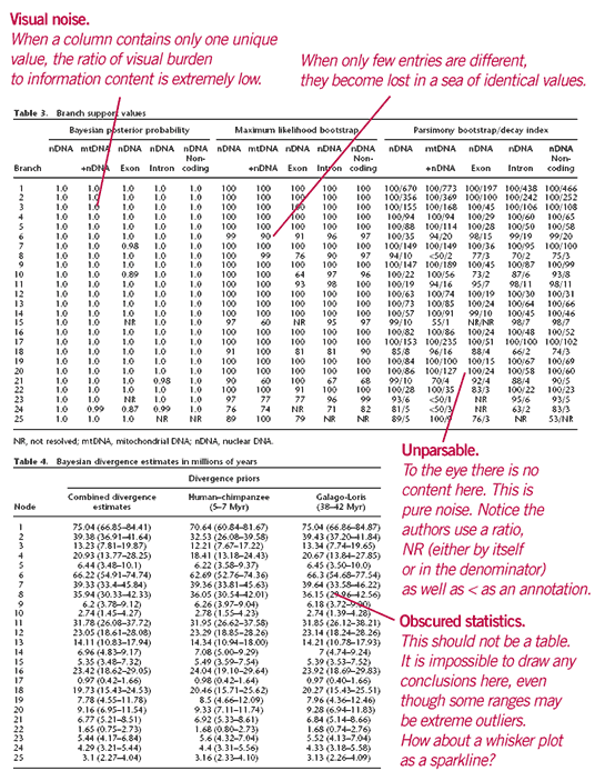
On the left half of the first table there is nearly no information – almost all values are 1.0. On the other hand, the right half of the table is packed so tightly with numbers as to make them visually unparsable. The second table is even worse, suffering not only from information overload, but also from both poor layout, and inconsistent precision (e.g. 7 (4.74-9.24)).
Poorly designed tables can suffer from visual noise (lots of ink, but no information), obscured statistics (descriptive statistics are hidden in numbers), unparsable content (too much information), misguided sightlines (poor row and column spacing), and burden of significance (reported precision is much higher than required for visual inspection). Such tables do not help understand the scale and tolerance inherent in the data and leave the reader faced with a deluge of numbers, to fend for themselves.
Visualization of Tabular Data
The method presented here provides an alternative to mitigate the problems outlined above. It is a visual approach that uses Circos[http://mkweb.bcgsc.ca/circos] to represent rows and columns in a circular fashion, and ribbons to represent cell values. Does it solve every table’s problems? No. It does provide, however, a way to capture the essence of the table and present it quantitatively and attractively.
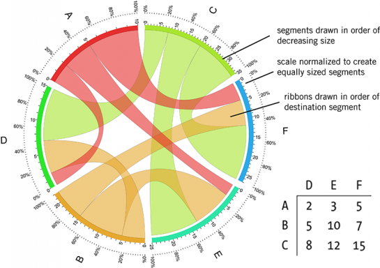
In this approach, relationships between data elements (e.g. a row and a column) are encoded by ribbons that join segments that correspond to these elements.
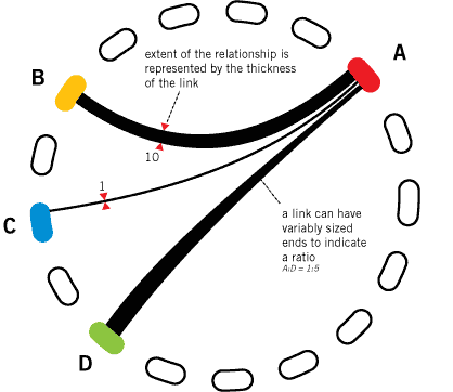
The ribbons can have different end thicknesses to represent a ratio between the elements. By coloring the ribbons (and/or adding transparency), such as shown below, the representation can focus on the flow of information in a particular direction (e.g. from A (left), or to A (right)).
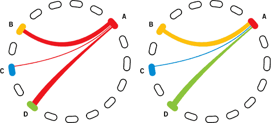
In practise, a visualization of a table based on this scheme might look like the figure below. Normalizing the segments to equal size is motivated by whether absolute or relative relationships are important.
Practical Example – Preference for Hair Color in Relationships
To illustrate this visual approach with a small data set, consider how one could visualize dating preference for hair color. You might have information about the relationship history of a large number of individuals and want to visualize the probabilities of transitions between hair colors in successive relationships.
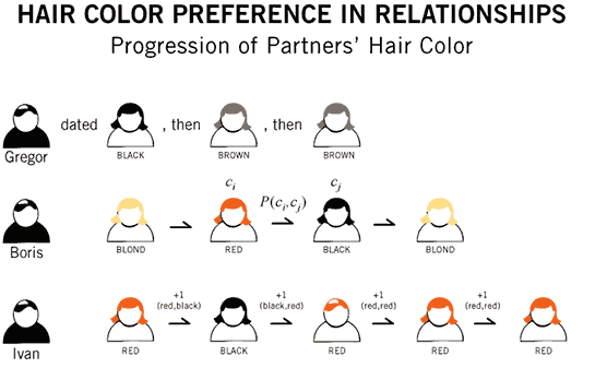
The data might look like this, where each cell represents the number of cases in which someone moved from a partner with one hair color (row) to another (column). For example, 2,868 individuals dated someone with red hair right after someone with black hair.

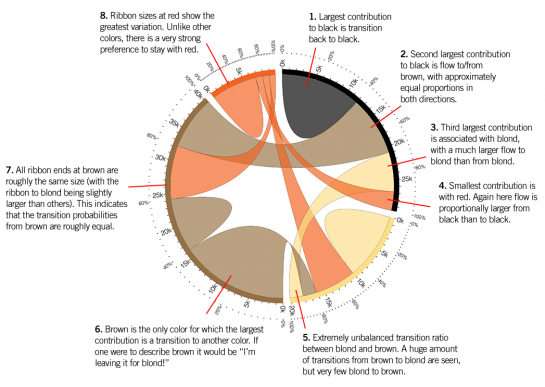
These data are synthetic (drawn from my own stereotypes) and visually represented in the image below
Several trends, not immediately discernable from the table, are made clear in the figure. Moreover, given that we can simultaneously process more visual details than numerical ones, this image can communicate many patterns at the same time and therefore enhance both interpretation and retention of information.
Practical Example – Reactivity of Chemical Elements in Minerals
The hair color data set was both small and synthetic. Let’s turn to something much more complicated to see how a visual representation can help avoid visual burden.
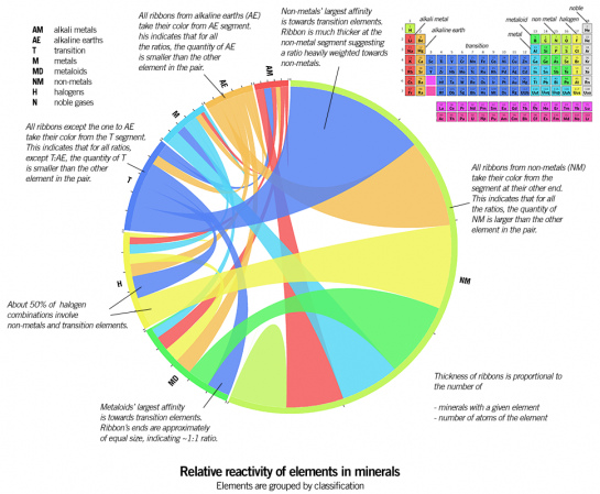
For this example, I used a database of mineral formulae [http://un2sg4.unige.ch/athena/mineral/minppmi.html] to extract all pairwise element ratios from each mineral. or example, Zabuyelite is Li2CO3 and would therefore contribute +2 (Li,C), +2 (Li,O), +1 (C,Li), +1 (C,O), +3 (O,Li), +3 (O,C). The resulting table was a 77 x 77 matrix [http://mkweb.bcgsc.ca/circos/export/mineral-element-ratio-table.txt] of ratios of elements.
To start, I condensed the table by combining elements of the same classification (e.g. alkali metal, transition, etc). In the table below, the counts are in units of 1,000.
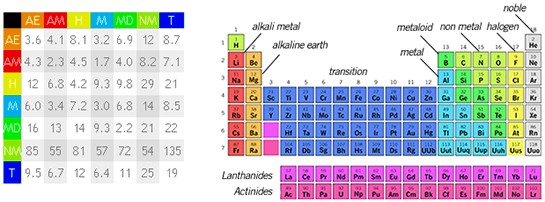
The image of the table below presents the trends in the data well. By keeping the segment size for each classification in absolute units, the representation also communicates information about abundance. By using relative tick marks however (every 10%) for each segment, it is possible to quickly evaluate extent of contribution from each ribbon to its segments.
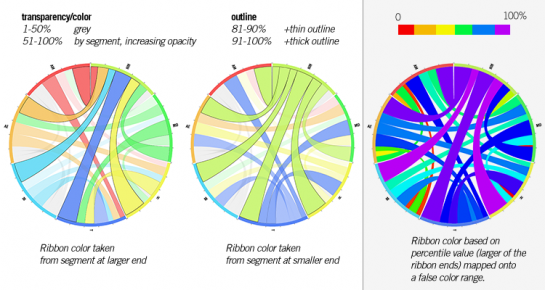
By greying out ribbons that provide minor contribution, and varying the amount of opacity as a function of percentile rank for the remaining ribbons, major patterns can be accentuated (image below, left). Alternatively, ribbons’ percentile rank can be mapped onto a rainbow color palette (image below, left).
Now what happens when the data for individual elements are drawn? It is no surprise that the result is a very complicated image.
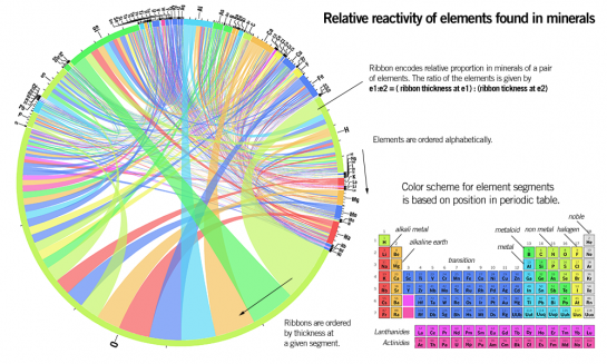
However, even at this level of detail, the image is visually parsable. First, relative sizes of ribbons quickly indicate which segments provide the majority of contribution to the table. The thin ribbons, which correspond to small values in the table, do not distract the eye to the same extent as a sea of small numbers in a table.
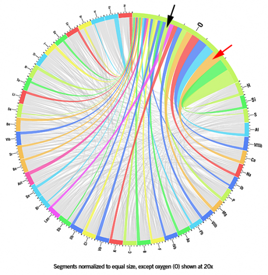
Oxygen’s abundance in minerals is reflected in the fact that its segment occupies half of the figure. To explore how oxygen combines with elements as a function of their abundance, the image below shows all segments normalized to equal size (except oxygen, which is shown at 20x) and uses color to focus on pairings between oxygen and other elements.
The manner in which the ribbons transit across the figure, and in places cross, indicates a difference between the order of reactivity and the order of abundance for the elements. For example, look at the ribbon between sulphur (S) and oxygen, indicated by the black arrow. Sulphur is 4th most abundant, but 12th in terms of number of O atoms that combine with it. Similarly, calsium (Ca) is 7th most abundant but 3rd in terms of reactivity with oxygen (red arrow).
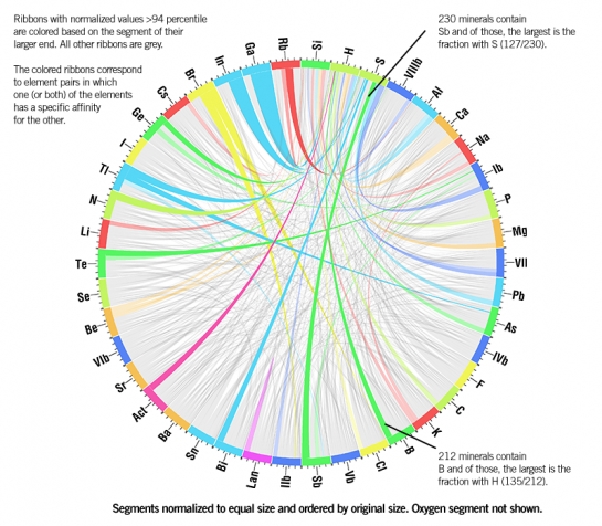
Another treatment of the figure is shown below, with the oxygen segment removed, and the ribbons that correspond to element pairs that have the highest relative affinity (strong preference) for one another shown in color.
Conclusion
While, it is possible to apply information design principles to a table to ensure that it communicates its content clearly, sometimes tables are not the best way to present data.
I hope that in this short writeup I have given you ideas that will be useful in your quest to articulate your own data sets.
Martin is a scientist who specializes in bioinformatics at the Genome Sciences Centre in Vancouver. Visit his site for more on Circos and some of Martin’s other data musings.

 Visualize This: The FlowingData Guide to Design, Visualization, and Statistics (2nd Edition)

Wow, a fantastic walkthrough! Really enjoyed it
Pingback: Justkez » Visually representing tabular data
These are the very definition of junk charts – completely unreadable. You’ve taken a useful presentation of data (table) and turned it into a completely useless splash of color.
This is the first explanation of the Circos type of visualization which has made me think they might not be complete chart junk. I still think they should not be used on data sets which are too large. It should also supplement, not replace, a table. The graphic gives me a general sense for its contents, but I can look up a row and column to find a specific value.
I found the chemical reactivity example distracting. It should be called “Non-normalized preponderance of elements in mineral compositions”, because it does not represent reactivity as much as the relative composition of the earth’s crust. If you were interested in reactivity, then Cl, Fl, and Li would appear much higher tham matalloids and transition metals. Giving Li-O two counts and O-LI three in your example is based on the arbitrary way the formula is written: on a molar basis, 2/3 Li-O and 3/2 O-Li would make more sense.
I presume there was no attempt made to normalize the tabular inputs to the Circos chart by the preponderance of each mineral, or by the number of elements in a category (e.g., transition metals have a much larger population than alkali metals). And I wonder how you’ve dealt with a mineral like “WOLFRAMOIXIOLITE”, with a formula of (Fe,Mn,Nb)(Nb,W,Ta)O4, which means that one lattice position in the crystal structure may have varying amounts of Fe, Mn, and Nb, while another lattice position has varying amounts of Nb, W, and Ta. Does Niobium get two counts, one for Nb-Nb (lattice sites 1 and 2) and the other for Nb-Nb in the opposite order?
Okay, it’s an example, and I can suspend disbelief in the contents of the graphic long enough to understand at least its construction.
tables should be used for reference, not communication or understanding.
it seems that the Circos charts are best at communication and understanding, as they are fairly useless at reference.
So it doesn’t seem right to compare the communicative power of a table vs a Circos chart.
They do look pretty but I am generally allergic to charts that have a high learning curve to understand their mechanism, before i can even begin to communicate with the data.
I think it would be particularly cool to have a large data set in a table and a companion Circos chart, where you could mouse over a data point and it would highlight its corresponding line on the Circos chart
My initial response is that this cure is worse than the disease.
I agree that graphs are often superior to tables, but am not convinced that these circular graphs are a better way of examining information than rectangular graphs.
Pingback: The Litmus | The Dapper Alchemist
i think you people are missing the point.
it does make sense to compare the communicative power of tables vs the circos chart because tables are often used to communicate information. the benefit would be maximized with a table for reference and a circos chart to show the relationships.
bar graphs are great but they only display 1 dimension. the circos looks promising for analyzing the relationships of information in 2 dimensions.
Perhaps a table could be complemented with an additional graphic showing relationship … but a standard table is absolutely critical for those wanting to incorporate that data into their own databases. Sometimes a boring table is exactly what you need.
In other words, the other graphics would be ‘in addition to’ but not ‘instead of’ a table. We shouldn’t let fancy graphics REPLACE useful information just because they may be easy to make and/or look cool.
I’d find this demonstration a lot more compelling if there was any indication that as much time was invested in the table design as in the circos designs.
As it stands, this reads like “all you have is a rock, but I have made soup from a stone!”
The Circos graphs are highly useful in their original domain: describing gene conservation in a circular bacterial chromosome (in addition to allowing for other annotations). And I applaud Martin Krzywinski for his contributions here.
In the case of tabular data, though, it feels as if the form has been stretched to a breaking point – a hammer in search of a nail.
And rainbow color palettes confound more than they clarify for ordered, continuous data (like percentages).
Geez, so much hatin’ on this guest article. Personally, I love people who take novel approaches to analyzing data through visualization, and I thought that was the point of this blog.
I think Circos, and the similar Flare BundledEdgeRouter algorithm, are useful for identifying previously unknown relationships and correlations in large datasets.
I think some posters are concluding from their own knowledge of the chemistry example presented here that the technique is merely window dressing, rather than a way to discover something you didn’t already know.
For an example which is probably less obvious to most people, this is an analysis of journal citation patterns that I found very interesting (originally discovered via a flowingdata post):
http://well-formed.eigenfactor.org/radial.html
Interesting, but not helpful.
Why should both rows and columns be treated equally? The geometrical metaphor doesnt feel appropriate.
First, thanks for reading and commenting. The skeptics’ comments are especially valuable in helping me work this prototype out … and eventually figure out whether there is a need for it.
There are a couple of things that I wanted to emphasize. Reading some of the comments I thought that I may have miscommunicated how this method fits in with tables.
The table is the container – this method is a presenter. Two different things, not in competition with one another. As a presenter, these charts are not meant for communicating individual data points. The table is perfect for that and should be used if your downstream application is in-depth data exploration or parsing. I intended to suggest that sometimes the table (a container) does not play the role of a presenter well.
Some of the figures *are* pretty crazy and colorful. In this prototype phase, I’m trying different ways to slice and show the data and see what sticks. Having worked on Circos for a while, everything is starting to look round to me – point about the hammer is well taken :)
The time to design these images depends on whether a clear question can be posed of the data. If it’s sufficient to show the data without applying any emphasis, remapping or normalization, then image preparation is very quick and involves running two scripts – one that parses your tabular data and then Circos, which generates the image.
If you have a complex data set, on the other hand, and want to demonstrate the existence of a pattern or guide the reader to a conclusion, then designing the image takes longer (but not longer than any other method, I think) and requires adjusting the configuration of the parser script.
A lot of people are skeptical of circos charts. I completely agree with the author’s comments about table illegibility, but tables do have a place. The distinction is reference versus presentation. If you’re trying to present an idea or illustrate trends, a table is usually useless. If you’re trying to provide reference data or statistics, a table is best. In other words, do you care about the exact values of the data, or the general ‘gist’ of what’s happening. The author’s point is that in many cases, the precise values of the data are given when it’s the gist of the relations thats important.
Regarding circos charts, their advantage is they do visualize data sets with many dimensions (I count five dimensions, represented using: circle regions, connectivity, arc thickness, color, and opacity). I think their criticisms are appropriate when they try to do too much: with this many dimensions to see, it’s easy to show so much that you show nothing, just like in the author’s table. The hair example was a brilliant and clear use of these charts — the mineral one tried to show too much.
Finally, a subtle point: color is a tricky method to visualize dimensions. 10% of the population is red-blue colorblind, and government agencies actually have regulations against conveying meaning through color alone (search “508 compliance”).
A slight correction: about 10% of the population is red-*green* colorblind. There are other kinds of colorblindness as well.
Point is, if you try to use color as a dimensionality of data, you need to use a very limited palette so as to not exclude a large percentage of your users (10% I feel is unacceptable, and so do 508-compliance regulators).
I was a bit skeptical until I looked at your hair color example.
I agree with your summary of it, in particular “… this image can communicate many patterns at the same time and therefore enhance both interpretation and retention of information.”
I like it for this example.
Thank you for the explanation.
Pingback: Visual Representation of Tabular Information - How to Fix the Uncommunicative Table on Datavisualization.ch
Pingback: Visual Representation of Tabular Information - How to Fix the Uncommunicative Table « Blog about Stats
This cure is as bad as the disease. Whether it will evolve into something else, I can’t say but I hope so.
Compare the awful table and the relative reactivity graphic. Stare at each for 1m, maybe 5m, and see how much information you walk away with. Given we have much more experience with tables, but even with 1m looking at the table and 5m looking at the Circos chart, I would be hard pressed to recall more than 1 interesting fact1 from the Circos chart. Oxygen is reactive. That’s the one thing I see.
Like any visualization, the goal must be to convey a story to the viewer. Any large table or dense visualization avoids the hard work of focusing the user on the story. If you don’t know the story to tell, then you need to keep searching for one. Dense graphics don’t help the search but muddle it.
How can this mess be more readable than a table?
Pingback: dekay.org » links for 2009-04-23
@DLo: I think it’s rather less 10% of men that are colour-blind, and far fewer women – under 1%.
Even if the overall prevalence is only ~4% though, a 30-person seminar would likely (>70%) have at least one colour-blind participant. As a matter of good manners, we should at least avoid red-green encoding (e.g. for negative and positive).
Pingback: Bookmarks para April 23rd de 11:02 a 11:04 — rodapé & marcadores
Pingback: andy.edmonds.be › links for 2009-04-23
That’s really interesting. The tables takes some getting used to though :)
you must be kidding me.
Pingback: links for 2009-04-29 « Treat with Jermolene
Pingback: Economic Education - Option B, I would love to read about how the table was created « learn4kicks
The element chart was absolutely useless, because the data itself made practically no sense. The hair color graphic showed some promise, because there is a genuine concept of flow present there. However, the seemingly arbitrary ordering of segments and coloring of ribbons ruined it all for me.
Either present the segments in the order they are in the data, or interleave columns and rows. The color should be determined by the data, not by its processing order – ideally, color ribbons to match the greater segment.
In general, I would say that this is a pointless graph for most tabular data, but could become useful for relational, square tables if the issues with color and placement are concentrated on. An interactive version could also be interesting, allowing one to highlight segments of interest.
Pingback: MONDAY | INFORMATION DESIGN — FLOWINGDATA.COM « Be Inspired Daily.
Pingback: Tagz | "Visual Representation of Tabular Information - How to Fix the Uncommunicative Table" | Comments
The negative comments are not helpful, and the tone of the comments even less so.Why so much venom?
I design visuals for learning, and this technique has its place in instruction if nowhere else. But I think it will be useful other places as well. Thanks for sharing a great idea.
Where can I find more like it?