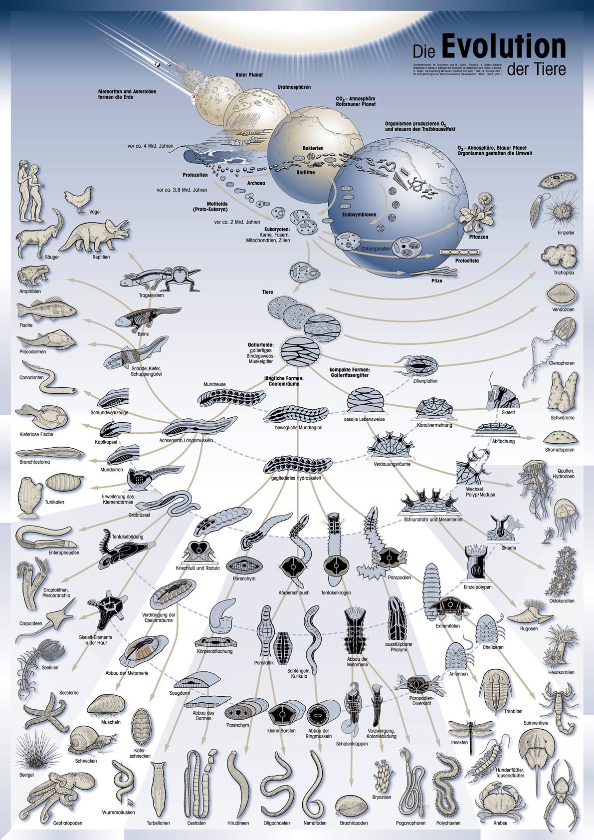
What do you think about the above graphic? Good, bad? Effective, or not? Sexy, not sexy? Discuss amongst yourselves.
[via Pharyngula | Thanks, Pat]
What do you think about the above graphic? Good, bad? Effective, or not? Sexy, not sexy? Discuss amongst yourselves.
[via Pharyngula | Thanks, Pat]
 Visualize This: The FlowingData Guide to Design, Visualization, and Statistics (2nd Edition)
New tools, refined process.
Lol is that adam and eve on the evolution chart? I call BS on intentional ambiguity for the intent of avoiding confrontation :P
Did I miss the primates or did humans evolve from chickens? And, wasn’t the first appearance of hominids in Africa rather than in Europe as suggested by the caucasoid prototypes?
The graphic tells a good story of animal evolution. It points out the major physiological characteristics that distinguish each animal taxa.
On this scale, humans and chickens aren’t different.
It tells the story well. It’s provocative in a good way as it sparks questions, but gets muddy at some leaf nodes. In other ways it avoid many controversies because there’s little indication of time and of course it leaves out many evolutionary steps. This may be good to pique interest.
My issues with it are that its hard to see the starting point. The actual starting point is in the upper left half, if you go by the arrows. Its not real obvious (atleast me it wasnt). Also I tend to look at things next each other and in this diagram they maybe related or they may not. Also I think it could have been better if it was more linear so you could see progression and where they delineate better.
Just saw an alternative on http://evogeneao.com/tree.html which I find much better.
I agree with Tad, although very informative/descriptive an obvious starting point would help. And linearity would certainly help.
In this less would be more to help. Could you imagine pulling this out in a meeting with executives?
I agree with Tzaadi that the “and then white people evolved” meme should really be over. Can we get a class poster or textbook graphic that actually represents the first humans, or at least doesn’t use a global minority like Europeans as the default?
That said, I actually do like this poster’s approach, for a couple of reasons:
1) It makes it a little more clear that evolution isn’t a directed process intending to lead toward humans.
2) It makes it a little bit more clear that the majority of life on earth ain’t mammals.
On the other hand, I’d love to see a similar diagram that does focus on mammalian evolution, because I think this approach would be great for making it clear that we didn’t evolve from today’s monkeys (they’re an endpoint themselves).
The complaints about the skin color of the humans seem to be looking for controversy where none exists. The final step of every creature on the diagram is the same shade of tan. It doesn’t seem to be trying to represent any specific race, just humans in general.
I think that (besides the fact its in German and I can’t read it)
the earth small-multiple at the top makes things more confusing than they need to be. Its not immediately apparent how its supposed to be interpreted. Other than that its very well presented.
I think this graphic does a good job of de-emphasizing the importance of humans in evolution. Contrast this with the traditional graphic showing a chimpanzee gradually turning into a human.
The main confusing part for me is that the evolution of the Earth is on the graphic as well, .
I agree with Mark in that one of the reasons I like it is how it shows the developmental differences between organisms. It also isn’t a human-centric diagram which I think is very important. Yes it may skip a few end steps here and there (i.e. primate to human), but I don’t believe the point of this graphic is to be specific to any one organism.
I guess if you’ve never seen a phylogenetic tree before this graphic would be harder to understand due to the layout. But overall I would consider this to be a great wall poster for a classroom.
It does a great job at what it’s trying to do. There are many possible critiques about how the poster should or could be trying to show something different. It shows the physiological difference in evolution.
Great for a biology class wall.
great addition to the usual phylogenetic trees and forks, but… no ferns, no orchids?
Not fair to the only organisms I was allowed ito bring in the classroom, IMO.
p.s. I know it says Tiere – but most aren’t Tiere anyhow and without plants it looks as if all Tiere were carnivores.
[“hegemonicon” doesn’t see white people – probably misses the blond hair of the female too – yes, the male’s hair is darker.]
The graphic is a nice piece of work but people shouldn’t be confused in thinking that one picture can speak the thousands and thousands of words that need to be said about evolution.
Pingback: Evolution | The Big Picture
There is so many things wrong with the accepted evolutionary tree, and so little solid science to back it up that it is astounding to me that so many people accept it is undisputed fact. Graphics like this don’t help that. They feed the imagination, which can be good, but in this case they are feeding the imagination faulty content.
ocasapiens, I agree, it’s very animal-centric. All the icons along the edges of the picture (with the exception of the eukaryotic protists or “Einzeller” at top right) are Animalia. Plants (Pflanzen) and fungi (Pilze) are represented by one icon each. Non-eukaryotes are also grossly underrepresented, though at least the Archaea and Bakterien get several tiny blobs each.
It can’t just be a matter of the biological diversity; both plants and fungi have their own equivalents of phyla, the basic body plans used to organize the animals in this poster. When you turn to the bacteria, there are differences in the fundamental biochemistry and cellular structure, far greater than anything found among the animals.
@Ken
Hard to select all the most relevant ones? and further info might overcrowd it. At least it gives small critters and Feomina sapiens their due. Perhaps somebody could do an other one for the phyto-phylogenetic tree – with soil protists, Pilze, prokariotes, and some pollinators too
@Aaron
one could be put question marks, or movable parts and update it with new data, if it were enlarged on a museum wall for instance
As a former worm researcher, I think it’s great.
As a current fish researcher, I find it a bit lacking.
As a future bacterial researcher… Swing and a miss?
Very nice graphical representation of lots of information to bring interest, particularly to the diversity of worms, and to the rest of evolution. Specifics of certain branches we may want to see are under contest so a broader coverage like this is a nice way to ensure its longevity. It could definitely use more diversity, but not so much as to make things to small to see.
Is there a way to zoom in? I can’t see where the non-living matter becomes living.
Maggie, ocasapiens, Ken, HalfT – keep in mind that this graphic is explicitly intended to show the evolutions of *animals* (Tiere, in German). So complaining about the lack of plants or bacteria is somewhat missing the point…
Taxonomically, this would correspond to Animalia, or Metazoa, although I see that they’ve added in Fungi as well – plus they very briefly sketched out “everything else” as well: plants, Bacteria, Archaea, etc. A lay person wouldn’t necessarily recognize all these organisms as “animals” (e.g. corals, sealilies, tunicates).
Overall, I think this graphic does an excellent job at what it is trying to get across. I especially appreciate how they explicitly indicate what the main differences are at the internal branch points – something you rarely see in a phylogenetic tree. That really puts the focus on the evolutionary process, rather than on the diversity at the leaves.
The alternative graphic that jan. proposed – http://evogeneao.com/tree.html – does a much poorer job, IMHO. Note that the majority of that graph is taken up be random, meaningless (in the sense that they contain no useful information) branches. They just have text labels at the leaves, so you have to already know what all these things are in the first place. And they provide no information on how the major branches differ from each other. In fact, the *only* interesting piece of information on this alternative graphic is how the various evolutionary steps are correlated with planet-wide events, such as the emergence of an oxygen atmosphere (“Oceans Rust” – bah), ice ages, mass extinctions, etc. But WTF were they thinking, having the time line going both left and right!?
I do agree that the top part of the “Tiere” poster could use some improvement. But my criticism is actually more with the lower half. What the heck do those curved dashed lines represent? Taxonomic levels? lineages that evolved at the same time? I can guess, but this really should have been made clear on the poster! Also, the division into grey and white blocks around the bottom edge seems to have been chosen in a fairly arbitrary manner.
I think it is relatively effective at showing the major steps in animal evolution. I like that around the perimeter are the extant species. There is a mistake showing an extinct reptile in the outer perimeter.
I would like to see some graphic indicator of the plant evolution, recognizing that its critical innovations are not being shown (i.e. its own circle or arrows going off the graphic.
I more or less agree with everyone else.
I’m not sure what the four earths / billiard ball effect is trying to convey. And I wish that there weren’t quite so many creatures drawn to look like rolls of fillet steak.
I’m also not sure about placing humanity (which appears to be very caucasian) right at the top of the page. It makes us seem less recent than we are. On the other hand, I do like the way that vertebrates are off to one side and the ratio of vertebrates to everything else: puts us in our place very nicely in a planet where life is made up almost entirely of microbes.
This is faint praise, which is unfair because I like this more than I dislike it.
Interesting image – thanks for posting it.
Ben
PS – the alternative graphic (linked by Jan and Patrik) is much better.
Fascinating.
was it supposed to be sexy? haaha or just suggestive?
The very modern humans are looking hungrily at der vogel. I guess this represents the stage of evolution at which our ancestors began domesticating animals for food. Wouldn’t they have been less well-groomed at that stage? The graphic starts out well as a detailed representation of evolutionary theory, and then the margins and border lines showed up unexpectedly, requiring the artist to skip some steps. It’s a little jarring.
Aaron: there’s plenty of evidence for evolution, its processes and so on. Please provide evidence for what you believe. Oh, wait, you can’t.
Pingback: One for the kiddies| Bondi Cigar
Not to be a jerk, but I have several edits you need to make. One of the pieces of fodder anti-evolution wingnuts use is inaccurate figures in textbooks, so accuracy is of great importance.
Graphic is ok (the pictures are well done!), but I don’t understand the lines between groups. Are the lines between older forms and present species meant to indicate ancestral lineages? I just looked closely at the worms at the bottom of the page, but you need to work on the phylogeny. Polychaetes, oligochaetes and leeches are sister taxa (segmentation is convergent for arthropods and annelids, not from common descent), nematodes are more closely related to the arthropods than to other worms (both share ecdysis). Bryozoans and brachiopods do not share common ancestry (the lophophore is another convergent feature).
Is this meant to be evolution of all life or of just the animals? I’ll echo other folks’ comments about the Chordate-focused view here. 2/3 of the organisms are from one phylum (chordata) compared to one species from another phylum (ctenophora), one domain is barely on there (bacteria) and the third isn’t mentioned at all (archaea).
On first glance it seems very congested, I think it would be much much clearer if it was at least 4x the size with the same information laid out in a much clearer way.
Also what questions is this graphic trying to answer? Does it show how many species are around today – No. Does it show how similar species evolved together from from the same ancestors – Well kind of, but it doesn’t show what the similarities are. Does it show the rate of evolution – No.
It does show the ancestry of particular species, but what actual question is that trying to answer? Yes it does spark questions like what are the actual differences between two nodes on the chart? and how long did it take to make that jump? but those questions could be answered by a better, more organised graphic.
i like it. not sure if i like it more than this http://visualthinkmap.ning.com/photo/photo/show?id=2168552%3APhoto%3A100
still good. thanks
Chris, that one is a beauty. A little outdated, perhaps. What’s a few billion years here and there. And tail-dragging dinosaurs? Still, I’d rather have that one on a tee shirt than this one, all things considered.
hegemonicon, the couple is clearly white. If they were African, their hair and facial features would be different. The actual skin tone has nothing to do with the fact that their features are caucasian (flowing hair, small/sharp noses, small lips, etc.).
I love that humans are relegated (properly) to a marginal place in the panoply of life rather than being described as the height of the evolutionary process. Time for a little humility!
Pingback: Science Etcetera, Mercuryday 20090415 | ideonexus.com