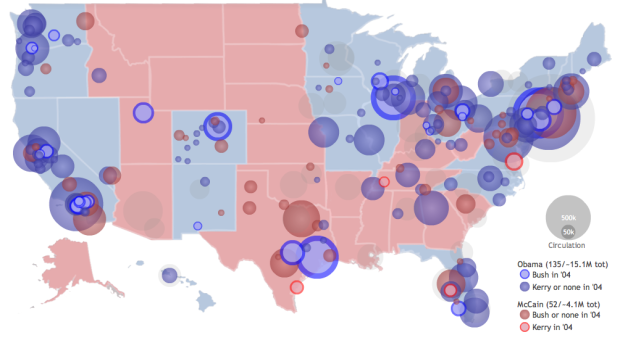
Philip, from infochimps, maps newspaper endorsements using data from the Editor & Publisher’s list. Circles with the blue radial gradient are newspapers that endorse Obama and John Kerry in 2004 while the red ones show McCain/Bush endorsements. The lighter blue circles are newspapers that endorse Obama, but actually endorsed George Bush in 2004. It’s a similar encoding for the John McCain endorsements except in red and the flip being John Kerry. Circle size is newspaper’s circulation.
The only thing I found a little weird was that the Dem to Rep or Rep to Dem endorsements were represented with all blue or all red. It certainly makes the circles stand out – which was the point – but doesn’t really indicate a flip. I had to mouse over the circle to find that out.
[via FlowingData Forums | Thanks, mrflip]
 Visualize This: The FlowingData Guide to Design, Visualization, and Statistics (2nd Edition)
Huh? Your explanation isn’t correct. The circles with a gradient/border are the ones that flipped parties between 2004 and 2008; the lighter circles are the ones that endorsed the same party across the elections.
@Reader – No. Circles with a gradient fill don’t have a border.
Wouldn’t it be cool if all the newspapers were reporting news instead of choosing sides and skewing information to endorse a particular POV?
Of course, that wouldn’t make for a very interesting map… just a bunch of grey circles. Hmmm… but then people would be forced to THINK about the issues themselves and make a truly ‘informed’ choice about X.
@Bryan – reporting just news and facts? ridiculous
Pingback: ::: Think Macro ::: » Reading blogs #4