BedPost – I put this up earlier for the FlowingData personal visualization project, but for those who missed out, Kevin recently put up a sign up form so that you get a notification for when the grown up activities tracker is ready for public use.
Bible Belt Got Back – We see fatness by state in this fun map by CalorieLab. The map title says percentage of obese adult population, but I think it really meant percentage of adult population that is obese. [Thanks, tarheelcoxn | via The Daily Dish]
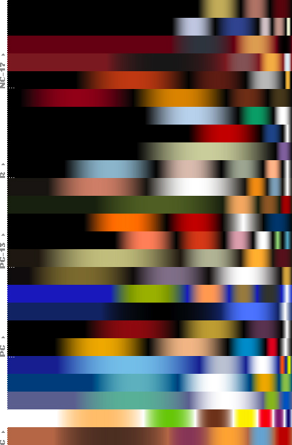
Movie Color Spectrum – I couldn’t find more details for this, but from what I gather, we see the dominant colors of selected movies that range from rated G to NC-17. Notice a pattern as we start from happy go-lucky movies for children to the uh, more grown up movies? [Thanks, Tim]
Pew Study on Religion – USA Today uses horizontal stacked bar charts to show results from the Pew Forum on Religion and Publilc Life. What do you think – easy or hard to read? Do all the charts make the data more clear?
 Visualize This: The FlowingData Guide to Design, Visualization, and Statistics (2nd Edition)
Pew Study Stacked Bars
1. If it’s only Yes/No/Undecided, the stacking is okay. By question 3, where there are numerous bars in the stack, it becomes difficult to interpret.
2. Sorting by ‘Yes’ is fine, except Total Population should definitely stay at the top, and other/unaffiiated should probably stay at the bottom.
Fattest States 2008 – A lot more red-tinged states than green-tinged. They don’t state what criteria they use to divide into different color groups, just that they had to change it this year.
The informal correlation between obesity and evangelicals is interesting.
Jon, each state has a number representing the percentage of its adult population that is obese (i.e., BMI 30 or over). The colors in the map represent 2-percent ranges (except for the two extremes). The divisions were empirically chosen to maintain a more-or-less equal numbers of states per color, so that the general distribution can be grasped without having to resort to reading the legend.
Think of it as similar to adjusting the levels in Photoshop so that the histogram for a photograph extends from left to right, giving the best tonal range.
If we simply used the same scale every year, all states would soon be dark orange. The average increase in obesity nationwide is 1 percent per year, so we’ve been shifting the color legend 1 percent right every year.
Aha. I had looked at the numbers, and hadn’t noticed that the cutoffs fit into 2-percentage-point bins. I understand why the rnages have to adjust to a moving distribution, I just didn’t know what guidelines had been used.