This guest post is by Rahul Bhargava, a Senior Software Engineer at nTAG Interactive, makers of interactive name badges for conferences and meetings. Email him : rahul [ @ ] ntag . com
A common thread in many of the great visualizations Nathan shares on Flowing Data is that they are created for external consumption – someone designs a neat way to represent a dataset to a larger, naive audience. I want to talk about the under appreciated utility of writing quick visualizations for yourself, to help you debug your own complicated or data-dense problems. This is not a new discussion, but I want to remind all the programmers out there that a speedily-created visual representation of your debugging log data might be the quickest way to find your problem! Below are some examples of what we’ve done at nTAG, and some techniques we’ve found particularly useful. Please post a comment about what you do.
Since I’m an engineer at a company that makes networked interactive wearable nametags, the problems I need to solve mostly involve bits and bytes flying around and between embedded processors or over a radio network. This includes things like:
- Logs of serial communications between chips
- Traces of interleaved code flow across multiple threads in a real-time OS
- Databases of information about activity from thousands of devices on a mutli-node wireless network
These log files add up, and are a huge pain to dig through. If you work on embedded devices, you know what I mean – grep can only help you so much. These in-house hacks don’t have the spit and polish of the finished products you’re used to seeing, but our 80 / 20 approach to visualizing gets the job done. The requirements for these types of visualizations are different – they don’t need to be immediately obvious; they don’t need a legend. You can assume the viewers are experts, fully knowledgeable about the domains the visualizations represent.
Anyway, onto the pictures! Here are some simple, but effective, examples of what we do and how we do it.
Stand back and take it all in
Trends are easier to spot in aggregate. Sometimes we spin up a visualization, tape it to the wall, and just stand back and stare at it for a while to understand what our system is doing.
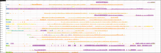
This is an image showing what radio access points our wearable nametags were talking to. Each row is a client on the network. The colored columns in a row indicate what access point the device was talking to over time (the horizontal axis). Individual colored bar height maps to RF signal strength. Zooming out reveals patterns – this particular image showed that two access points (orange and purple) carried the most load over this period of time. This is an image rendered by a php script using gd, reading from raw data parsed by another php script into a database.
Find correlations with static images
We render multi-variate images in order to try and illuminate the conditions that lead to certain bugs. Plotting more sets variables on the same axis helps us look for correlations between larger sets of data.
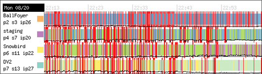
Here we were trying to determine why our radio network went up and down during a period of time. Was it due to load? Each row is a radio access point’s state over time. A row’s background color indicates what other access points it is talking to – a red bar indicates a failure. The overlaid black line shows how many of our networked nametags were associated with that particular access point over time (the horizontal axis). This image helped us prove there was no correlation between client load and down-time. This is another image rendered by a php script using gd, reading from raw data parsed by a php script into a database.
Browsers are great rendering engines
Often we have a log file full of useful information, but it’s too hard to read! For these smaller datasets we write a simple parser that reads the log file and outputs more human-friendly HTML, using CSS to decorate errors or warnings. Simple idea, but often overlooked in favor of digging through raw text files. With a little styling the thing that you want to see pops right out, and it’s just a small amount of work.
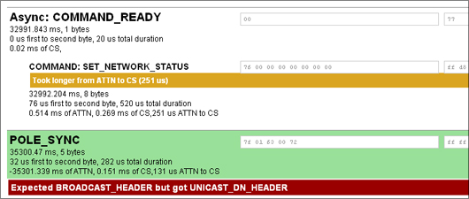
Here we were investigating SPI communications on our custom-built radio access point. This is an HTML page generated by a php script walking a CSV export from a logic analyzer.
Inspirations
Hopefully that sampling inspires you to remember the power of one-off visualizations. Some of our inspirations include:
- Distellimap – Ben Fry has done a few projects that paint real world program flow on top of source code itself
- Apple’s Instruments Profiler – Apple again shows how much a little attention to layout can help… this is so much prettier than JProfiler
Have you seen other powerful visualizations like this? What are techniques you employ on a day-to-day basis?
 Visualize This: The FlowingData Guide to Design, Visualization, and Statistics (2nd Edition)
Great post. For public consumption or not, these are great tips to get started.
My colleague Shawn recently shared one of his debugging visualizations. I wrote about it here: http://www.tom-carden.co.uk/2008/02/08/show-it-all/
Great post. For public consumption or not, these are great tips to get started.
My colleague Shawn recently shared one of his debugging visualizations. I wrote about it here: http://www.tom-carden.co.uk/2008/02/08/show-it-all/
no arguments here. i think rahul brought up lots of excellent points about data viz for personal consumption. sometimes we (including me) get wrapped up in the aesthetics of viz that we forget that it doesn’t take a ton of time for it to be useful.