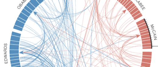
Jonathan Corum and Farhana Hossain created a network visualization that shows readers who has spoken about who in presidential debates. Scroll over each candidate name to isolate the connections; important/interesting points are highlighted. Candidates are colored blue and red for their respective political parties.
There are three main things that this thing shows — who has spoken about who (lines), who has been talking the most (circle segments), and finally, attention by party (red and blue). In usual fashion, The New York Times churns out another beautiful graphic. Not only is the visualization attractive, but unlike so many network diagrams before it, this graphic is also useful and informative.
 Visualize This: The FlowingData Guide to Design, Visualization, and Statistics (2nd Edition)
Amen to that! This visualization is interesting, fresh, and extremely informative while being intuitive. They continue to impress me. Now all we need is some type of BS meter/visualization…
This is a very nice visualization, but I have a couple of issues. It would be nice if when you rolled over on someone’s name it also showed who they talked about. Also, rolling over Clinton, it looks like she has gotten the vast majority of the attention, but her circle segment is barely any bigger than the rest. Other than that, this is very informative.
@andrew: oops. that would probably be due to my own negligence. the circle segments that i said represent how much others have spoken about a candidate actually show how much that candidate has spoken.