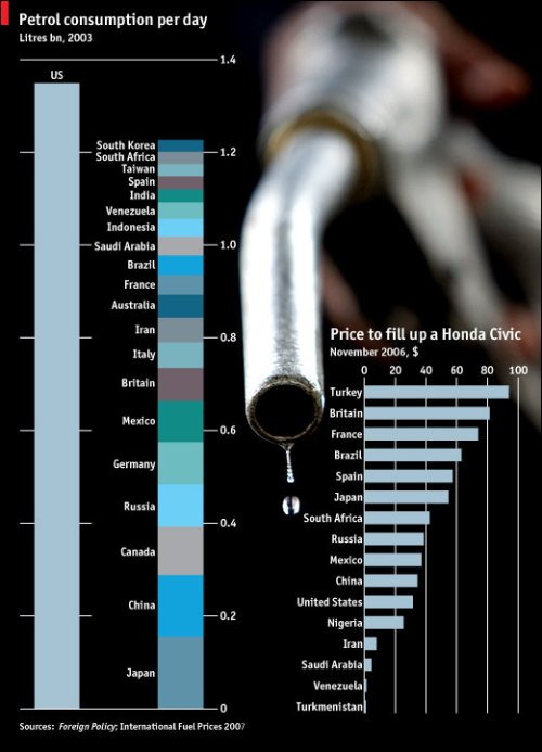
A very simple graph from The Economist (spiced up a bit with a picture of a delicious gasoline droplet) that quickly gets its point across. The United States uses a lot of petrol compared to other countries, while at the same time, it costs less to fill up a Honda Civic in the US than most other places.
However, the left graph is based on 2003 data. I wonder what the graph looks like now? Similar, I’m sure, but still something to look at.
Anyways, something really interesting here — even though Venezuela has crazy low gas prices, the average petrol consumption per day over there is still quite low. Whether this is a cultural thing or just some weird supply and demand thing (that I have no clue about) might be worth some investigating.
In any case, just because we have lower gas prices (that we still complain about) than a lot of the world, we’re still consuming a lot. What’s our excuse?
 Visualize This: The FlowingData Guide to Design, Visualization, and Statistics (2nd Edition)
holy f*ck