Visualization
Showing the stories in data through statistics, design, aesthetics, and code.
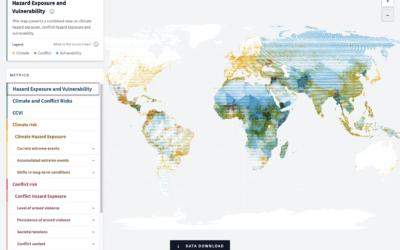
Scoring climate, conflict, and vulnerability around the world
In an effort to measure and highlight risks globally, the German Federal Foreign…
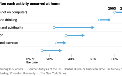
Increasing time spent at home
For NYT’s the Upshot, Ronda Kaysen and Alicia Parlapiano highlight analysis by Patrick…
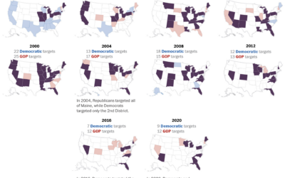
Presidential campaign target states, since 1952
We mostly hear about a handful of swing states these days, as presidential…
Who gets shipped in fan fiction
The Pudding examines who gets shipped, which means a pairing of characters in…
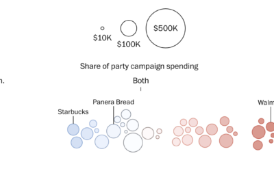
Restaurant preferences via campaign spending
For WP’s Department of Data, Kati Perry and Adrián Blanco examine campaign spending…
Uber and Lyft use lockout loophole to avoid paying drivers
Based on rideshare data collected by Bloomberg, it appears that Uber and Lyft…
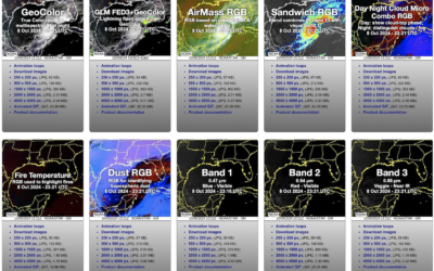
Seen from space: Hurricane Milton approaches
NOAA has a viewer for their GOES (Geostationary Operational Environmental Satellite) system, which…
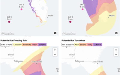
Hurricane Milton potential threats
Hurricane Milton continues towards Florida, estimated to make landfall on October 9, 2024…
Preparing for a hurricane, a visual guide
For The Washington Post, N. Kirkpatrick, Aaron Steckelberg, and Leslie Shapiro provide a…
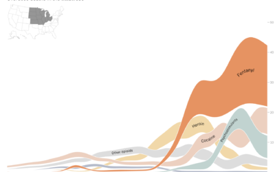
Rise in drug overdose deaths, led by fentanyl
Deaths by drug overdose in the United States increased sharply over the past…
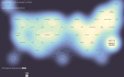
Political search interest in 2024
In a follow-up to the 2020 project, Moritz Stefaner and Google Trends show…
Smuggling fentanyl precursors, illustrated
In their ongoing series on fentanyl in the United States, Reuters illustrates the…
Maps showing migration out of cities
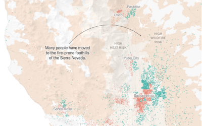
Mira Rojanasakul and Nadja Popovich, for The New York Times, mapped migration out…
Jimmy Carter’s longevity compared to other U.S. presidents
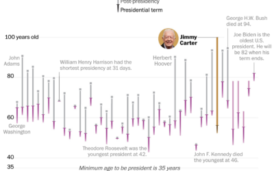
Jimmy Carter, the 39th president of the United States, turned 100 years old.…
Reordered baseball lineup over decades
Baseball’s batting lineup has changed from what seemed to make sense to what…
Rainfall in the path of Hurricane Helene
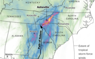
Western North Carolina got the brunt of Hurricane Helene with two feet of…
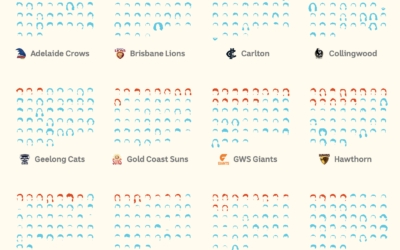
Counting mullets in the AFL
The mullet has grown popular in the Australian Football League. ABC News counted…

