Visualization
Showing the stories in data through statistics, design, aesthetics, and code.
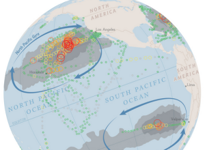
Mapping plastic in the ocean
In research efforts to understand marine debris, Andres Cozar Cabañas et al recently…
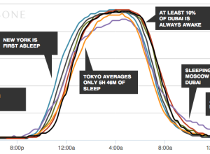
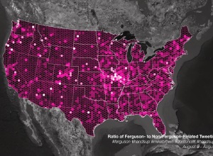
Talking Ferguson on Twitter and localness
For trending topics, Twitter likes to show an animated map of how a…
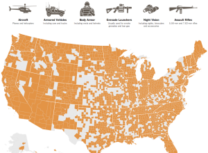
Map of military surplus distribution
With the situation in Ferguson, the New York Times mapped the distribution of…

FuelBand Fibers visualizes daily activities beautifully
Leading up to a Nike women’s 10k run, design studio Variable made FuelBand…
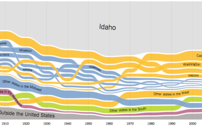
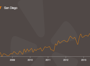
State of birth, by state and over time
We’ve seen migration within the United States before, but Gregor Aisch, Robert Gebeloff,…
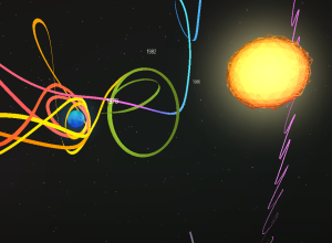
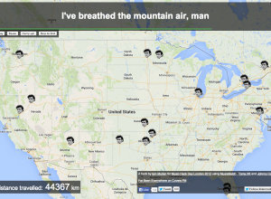
Interactive documentary takes you through space and orbits
Impressive work in A Spacecraft for All:
This Chrome Experiment follows the unlikely…
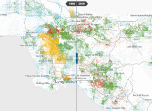
Where the poor live, a decade comparison
To better understand race and poverty, MetroTrends maps where people live whose income…
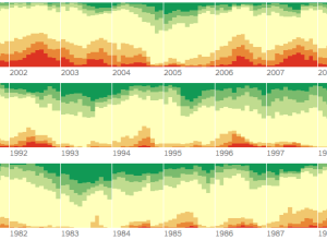
Mapping the spread of drought, nationally →
Although California has perhaps had it the worst, drought also affects other states,…
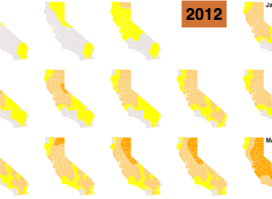
California drought in small multiples
To show the increased levels of drought throughout the state of California, Kyle…

Wi-Fi strength revealed in physical space →
Digital Ethereal is a project that explores wireless, making what’s typically invisible visible…
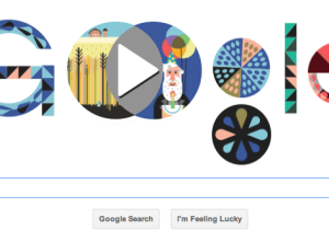
Google Doodle Venn diagram →
In celebration of John Venn’s 180th birthday, today’s Google Doodle produces a Venn…
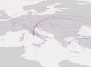
Cultural history via where notable people died
A group of researchers used where “notable individuals” were born and place of…
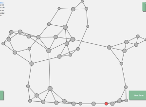
Network visualization game to understand how a disease spreads →
Vax, a game by Ellsworth Campbell and Isaac Bromley, explores how a disease…
Explorations of People Movements
A new data source gave rise to a different set of visualization projects. We see people.
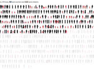
Civilian casualties in Gaza →
Lazaro Gamio and Richard Johnson for the Washington Post cover civilian deaths in…