Visualization
Showing the stories in data through statistics, design, aesthetics, and code.
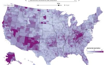
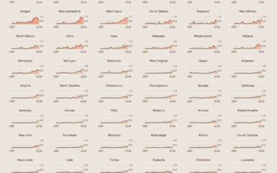
Mapping death in America, 1980 to 2014
Nationwide mortality data relies on death certificates, and when cause of death is…
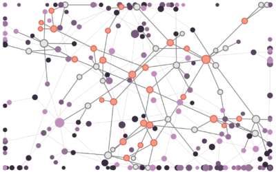
How disinformation spreads in a network
Disinformation is kind of a problem these days, yeah? Fatih Erikli uses a…
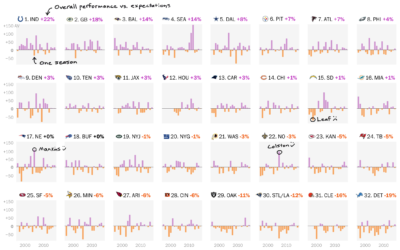
NFL draft performance vs. expectations
Reuben Fischer-Baum for The Washington Post looks at professional football expectations given their…
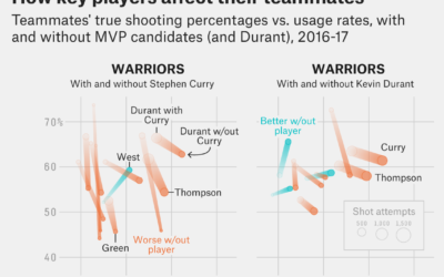
Stephen Curry for MVP, because he makes his teammates better the most
The choice for Most Valuable Player in the NBA is only minimally about…

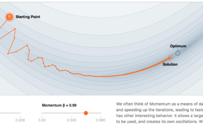
Why momentum works
Gabriel Goh models momentum over at the new machine learning journal Distill. The…
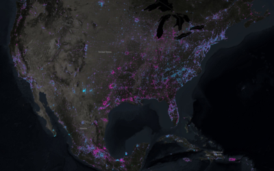
Shift in world’s night lights
NASA recently released composite images of the Earth at night based on 2016…
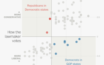
Senators and Reps whose voting doesn’t quite match the constituent’s
I know, it’s only April 2017, but some senators and representatives have some…
Finding the craft beer capital of America
You had me at craft beer. Russell Goldenberg for The Pudding looks for…
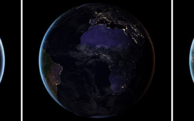
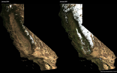
New images of Earth at night
NASA just released a composite map of the world at night using satellite…
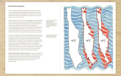
Climate Change Coloring Book
The Climate Change Coloring Book by Brian Foo makes data tactile and interactive.…
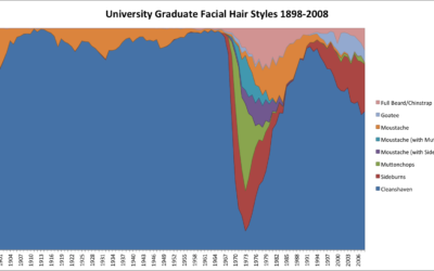
A century of facial hair styles
Facial hair styles change with the years. One year it might be more…
Challenges of visualization in industry
The most recent Data Stories episode with Elijah Meeks is worth a listen…
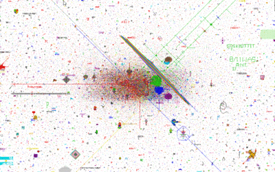
A story of humanity in the pixels of a Reddit April Fool’s experiment
On April Fool’s Day, Reddit launched a blank canvas that users could add…
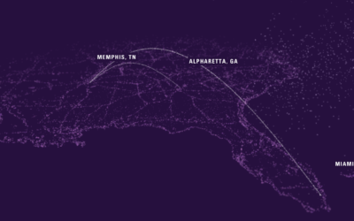
Listen to soundtrack based on FedEx shipment tracking
FedEx (yes, the shipping company) put up an interactive piece that audiolizes a…
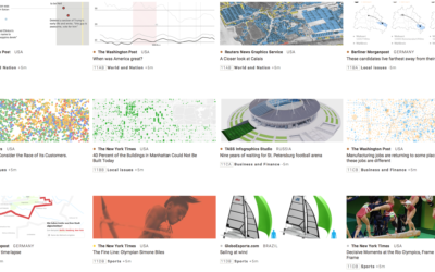
Best infographics in the news
The annual Malofiej Awards is the big one for infographics in the news.…