Projects
Graphics by Nathan Yau, borne out of everyday curiosities, learning experiments, and mild insomnia.
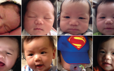
The Change My Son Brought, Seen Through Personal Data
I combed through personal data that I've actively and passively collected since early graduate school to see how life is different now with a 6-month old.
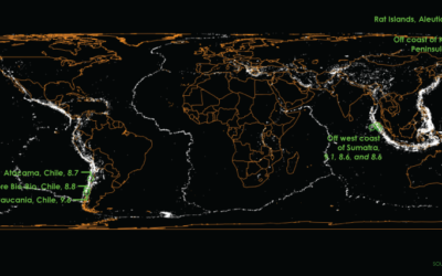
Mapping a century of earthquakes →
Earthquakes are in the news a lot lately. A quick search shows a…

Last day to pre-order quotes poster
It’s been an interesting few days. I thought a few people would find…
Movie quotes as charts, poster edition
Since so many of you kind people asked, the movie-quotes-as-charts graphic is now…
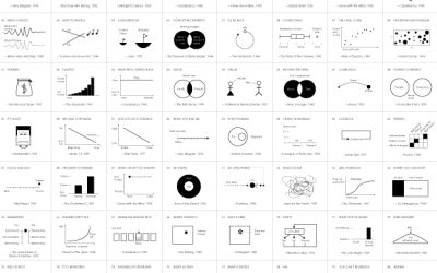
Famous Movie Quotes as Charts →
In celebration of their 100-year anniversary, the American Film Institute selected the 100…
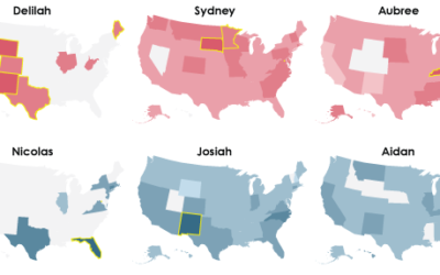
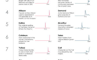
The Most Unisex Names in US History
Moving on from the most trendy names in US history, let’s look at…
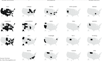
Most popular porn searches, by state
We’ve seen that we can learn from what people search for, through the…
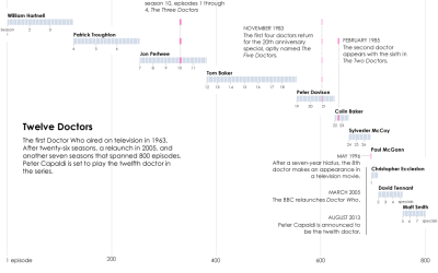
Doctor timeline for Doctor Who
I have yet to see a full episode of Doctor Who, “the longest-running…
The Most Trendy Names in US History
Names are incredibly personal things. It’s how we identity ourselves. We associate others,…
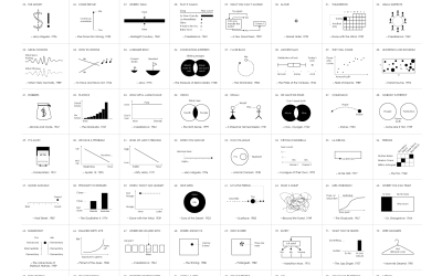
Getting started with visualization after getting started with visualization
Here's where to go next once you've covered the basics of visualization. When it's time to actually start making things.