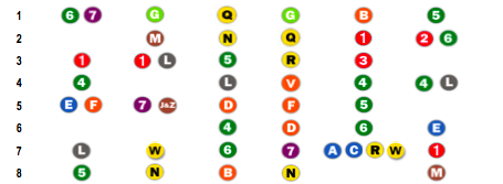
I had a chance to browse through some of my subscribed feeds today, and I saw a post called Noisy Subways by Kaiser over at Junk Charts blog. So I clicked, since it isn’t one of those full feeds, and then I saw The New York subway report card. I smiled, because, well, I made that chart just a few days ago!
Just a disclaimer: The Times chart was just The New York Times version of the original Straphangers report:

Anyways, there was bit of a discussion, which again, I found very amusing. I felt kind of special in a way.
There were two main points to the post – 1. Noisy data; and 2. Chart is hard to read. I’m very tired right now, so I’ll just say a few things.
Yes, the data is really noisy, but why shouldn’t it be? We shouldn’t assume that all six variables are positively correlated. It’s very possible for a line to be very reliable, but have no seats. One could argue that the lines with more people HAVE to be more reliable, because if something goes wrong, more people are going to get screwed.
Secondly – sure, the chart is a bit hard to read at a glance, but who’s the audience? New Yorkers are the audience, and the first thing that they’re going to do is look for their subway line. That’s what I did. With the audience in mind, I think the chart serves its purpose.
Most of the commenters provided decent ideas for alternative graphics. My opinion is that with this kind of data, it’s up for grabs. Audience is key though for charts, graphs, plots, maps, etc in a newspaper. Spiders and whiskers won’t make sense to many people. You’d be amazed of how many people don’t know how to read a scatter plot. The public is getting better though. They’ll get there.
As for the person who left the comment about the gaps in the chart. I’m going to assume that was in haste. Some lines are tied, hence some blanks spaces.
Welp, that was fun. Yawwwwn. Time for bed.

 Visualize This: The FlowingData Guide to Design, Visualization, and Statistics (2nd Edition)
