I’m sure a lot of you love The Beatles. I’m not a huge fan myself, but for those who are, you will love these graphics from designer Michael Deal.
The graphic up top shows the level of collaboration between group members. The level of shared authorship was a lot higher early on and then pretty much died off before the breakup.
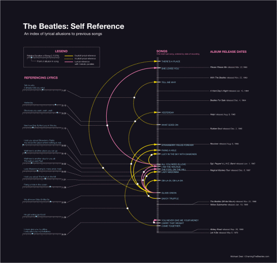
This one shows the references made to previous songs within the newer ones.
Check out others on Michael’s site.
The hope is that this series can get something bigger started: Charting the Beatles.
[Thanks, Michael]


 Visualize This: The FlowingData Guide to Design, Visualization, and Statistics (2nd Edition)

Nice post but one correction: the designer’s name is Michael Deal, not Bean.
thanks, ian. fixed.
Pingback: Beatles Music in Infographics « Paulmanac
Pingback: Daily interesting articles | Aww Dip
Pingback: Proportional Response... an aggressively normal take on everything
Pingback: Weekly Roundup: Design Related Links #5 « Discovery Session… by Gerard Dolan
Pingback: ツイッター・フォロワーがアナリスティンクに表示される3のフリーソフト | WEB FREE