I’ve dabbled quite a bit throughout my academic career. I started in computer science, then electrical engineering, and then statistics. I also considered a future in business, environmental science, civil engineering, and urban planning, but I’ve finally settled on a combination of statistics and design — data visualization.
Here are the 4 visualizations that got me interested and left me wanting more.
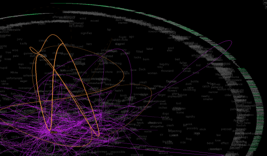
TextArc by Bradford Paley
I vividly remember sitting in the back of class during my first quarter as a graduate student. My professor now adviser was giving a giving a presentation that was (sort of) on data visualization. There it was – TextArc – up on the screen.

It was a visualization of Alice in Wonderland that displayed data in a way I had never seen before. It wasn’t a chart or graph. Rather it was an interactive piece that drew you into the story and encouraged you to explore.
I was really impressed but still wondered why a professor of statistics was talking about this in a statistics course. Then I realized why after I saw the second piece.
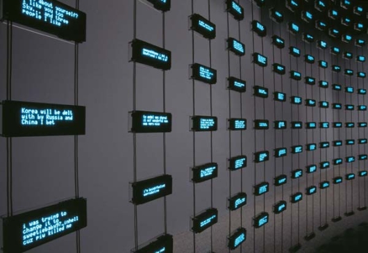
Listening Post by Mark Hansen and Ben Rubin

Listening Post is a collaboration between artist and statistician that “culls text fragments in real time from thousands of unrestricted Internet chat rooms, bulletin boards and other public forums.” That’s when a little light in my head went on and I realized that this is something that I would enjoy and do for a living. I went home and looked for more.
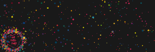
We Feel Fine by Jonathan Harris and Sep Kamvar

We Feel Fine is an “exploration of human emotion” that periodically grabs blog entries looking for statements of how people feel. What you end up with is a flurry of emotion from happy to sad to angry. It’s all interactive and again encourages exploration.
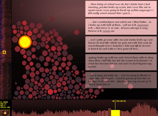
The Dumpster by Golan Levin

The Dumpster shows human emotion from a different angle – relationship break ups. Again, data is grabbed from blogs, but this time the parser looks for instances when the writer has broken up with someone or has been broken up with. There are several ways to explore the data by clicking specific instances or browsing the “zoomed out” views on the side panel and bottom.
Now I’m Hooked
After I saw these four pieces, I was pretty much hooked. They are all art pieces but with science behind it, and I think that’s what I enjoy the most. Sometimes it’s the science behind the beauty that makes a piece an experience while other times it’s the display of science through beautiful art. I can’t imagine pursuing any other field.

 Visualize This: The FlowingData Guide to Design, Visualization, and Statistics (2nd Edition)

Pingback: 4 Data Visualizations That Inspired Me to Learn More | FlowingData |