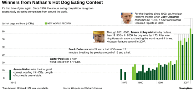
It’s July 4 this weekend. You know what that means, right? It’s Independence Day, and really, there’s no better way to celebrate than to stuff down as many hot dogs down your throat as you can in ten minutes. Or if that doesn’t sound appetizing, you can just enjoy watching the annual Nathan’s hot dog eating contest on Coney Island.
Joey Chestnut won the hot dog crown for a second time last year. Will he win again or will Takeru Kobayashi take back the crown? Punch your ticket in the poll below. Take a look at the full version of the graphic above to make a fully educated decision.
{democracy:10}


 Visualize This: The FlowingData Guide to Design, Visualization, and Statistics (2nd Edition)

Nice graphic! I’m hoping Kobayashi can pull it off, but I’m not sure, following his poor performance here –
Using a bar chart for time series data?! I’m shocked. What is this, USA Today?
what’s wrong with that? you can read it, time is labeled, nothing is misrepresented.
line charts are useful if the slope of the line is meaningful. this is often the case for time series, which are often continuous functions. so if you have an observation for time T, and another one for time T+1, the slope can give you an indication of the value for the function anytime in between.
here you have discrete, unrelated observations, so a slope between them is not meaningful and probably misleading.
Bar charts it is.
I’ve always heard that one should use a line chart if the trend is more important and a bar chart if the individual values are of interest. Here you are more interested in the individual values so I agree with your choice. Also, the new world records would be less obvious with a line chart.
I like your book :)
Thanks for your kind words about Creating More Effective Graphs. :)
Time series with lines makes sense when there is serial relationship between the events.How connected are the events from one year to the next? Are the contestants even the same?
Kobayashi would be considered a level-shift in the series. Even scarier is the jump from 20 to north of 60 in just 30 years.
I think bar charts are just as adept at showing trends, but people default to line charts for time series data because it’s thought of as a continuous variable. That’s not to say it’s an absolute rule though. I agree with Naomi that the bar format you have helps to visualize the new world records.
I completely agree with Joan.
The distinction that is most relevant is whether the data is continuous or discrete. Temperature over a 24 hour period is continuous, and therefore a line graph is an accurate representation of the the reality.
Event winners, whether hot dogs, or racing times, may trend over time, but are discrete events and therefore bars are a better choice.
A potentially nebulous middle ground might be sales figures for a time period. The periods are discrete, but sales may have some trending and influencing that imply continuity.
What would make this a real good infographic is if you used hot-dog-shaped bars.
(Pardon me while I dislodge my tongue from my cheek!)