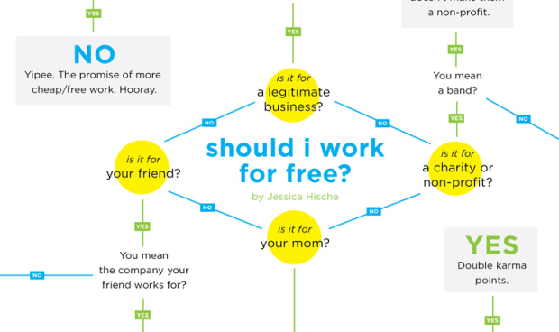
Designer Jessica Hische gets her flowchart on to help you decide whether you should work on that project for free. In short, if the client is not your mom or a friend you owe big, they better pay up. Love the blunt honesty from Hische, who I’m sure gets all sorts of odd offers. See full flowchart here.
[Jessica Hische via @MacDivaONA]


 Visualize This: The FlowingData Guide to Design, Visualization, and Statistics (2nd Edition)

i really like the font. any idea which one it is?
@Thomas – According to bottom right corner of the page, it’s this:
http://typekit.com/colophons/fft2cll
boy, i am really blind :/
I’m caught in a loop.
On the left-hand side of the chart, it asks, “Are you altruistic?” I said “No,” which leads me to “Are you sure about that?” Once again, I said “No,” which directs me back to “Are you altruistic?”
But I’m still not sure that I’m not altruistic! Argh!
Non profit used to mean small and community based… or growing and community based. Now it includes large institutions that pay good salaries and benefits to their regular mid to upper level employees. This chart needs to segment different size NPOs.
Not that big is the only criteria. Just sayin’
Thanks for spotting this (again!) – really great visualisation. There’s a brilliant video on YouTube with a similar sentiment about working for free (however, do not watch if you don’t like bad language) http://www.youtube.com/watch?v=VfprIxNfCjk.
IMO that’s pretty hard to read without arrows or some indication of flow.
How would I do this like she did all in CSS3? I’m pretty new at web design but thought it would be neat to try… thanks =)