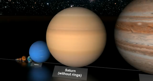
You’ve most likely seen a couple of views of the universe to provide a sense of scale. Main point: you’re tiny. Here’s another video. This one focuses on star sizes. it starts with our solar system and then moves up to VY Canis Majoris, the largest known star in the universe. The video was actually made last year, but still fun to watch. It’s got a few drops of dramatic music in there, too.
[morn1415 via Simple Complexity]


 Visualize This: The FlowingData Guide to Design, Visualization, and Statistics (2nd Edition)

i thought Jupiter, mercury etc were planets & not stars ….. :-)
Context first :)
Pingback: Comparação entre tamanhos de corpos celestes « Graphimera
This shows the Earth spinning in the wrong direction.
Planets spin the opposite direction from the other side of the solar system.
Unfortunately the continents are drawn on the Earth, so it’s not viewed from the other side. It really is spinning the wrong way.
I was just kidding :).
Pingback: Size matters II « Picture This
Pingback: Sterne im Größenvergleich | By Robert | www.die-truppe.com
Ref Star Size Comparison, have you yet (could you) do a similar size flow of distance/time? Eg distance/time within our solar system, between our sun and the nearest star, the diameter of our galaxy, distance between our galaxy and the next nearest, distance/time between alternate ‘ends’ of the universe (as currently perceived). I saw the idea for this during the credits of the Jodie Foster film ‘Contact’. The problem as I understand it would be that the distances are so vast that it would be impossible to represent them in any way that could be perceived on the screen of a PC. But anything you could do of this type would be awesome.
http://www.youtube.com/watch?v=fKTu6B4Rgek
Alternate Video on youtube which is not blocked outside the usa.