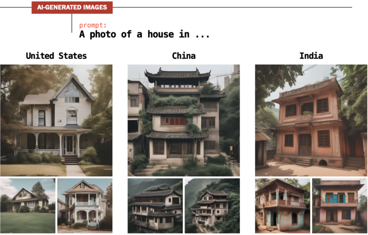
For The Washington Post, Nitasha Tiku, Kevin Schaul and Szu Yu Chen demonstrate how AI generators lead to biased images. The systems use data slurped up from the internet to guess what pixels to show based on the text (i.e. a prompt) that you provide. So the images are often the result of calculations that look for the most common pixels in the source data rather than a real-world representation.
To most people, the bias probably seems harmless with an assumption that the systems will improve. And that might be the case. But just you wait until an AI chart generator, based on the inputs of visualization critiques scraped from the internets, only produces bar charts with obscene amounts of white space no matter what you try. Then you’ll be sorry you didn’t care sooner.


