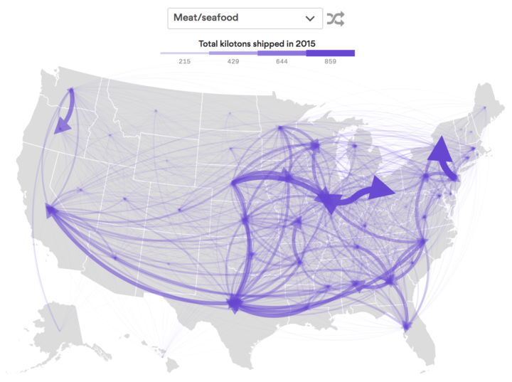
Using data from the Freight Analysis Framework, Chris Canipe for Axios mapped the flow of goods between states. Select a category of goods from the dropdown, and the map shows total kilotons of the selected goods shipped out of each state through freight. Thicker arrows represent more kilotons.
Flow of goods between states
Second Edition
 Visualize This: The FlowingData Guide to Design, Visualization, and Statistics (2nd Edition)
 Visualize This: The FlowingData Guide to Design, Visualization, and Statistics (2nd Edition)
New tools, refined process.