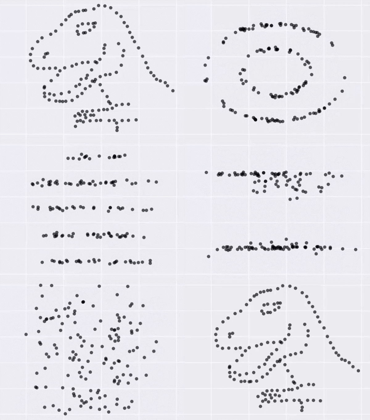
Summary statistics such as mean, median, and mode can only tell you so much about a dataset. Their scope is limited because for them to be useful, you have to assume things like distribution and dependencies. Visualization helps you see what else there is.
Justin Matejka and George Fitzmaurice demonstrate in their paper for the ACM SIGCHI Conference, in which they developed a method to generate datasets that “are identical over a range of statistical properties, yet produce dissimilar graphics.


