Forget about Shakespeare. Let’s look at a real classic: Love Actually. Somehow I made it through the entire holiday season without watching the movie, as someone in my household who is not me really likes it. I’m more of a It’s a Wonderful Life guy.
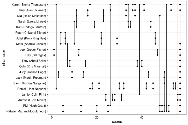
Anyways, David Robinson, a data scientist at Stack Overflow, did a quick analysis of character appearances in Love Actually. The chart above shows how characters appear together in each scene. The vertical axis represents characters and the horizontal axis is scene number. Each vertical line essentially represents a scene and dots signal character appearances.
Check out that last scene where everyone comes together and we learn that love actually is all around. Tear.


