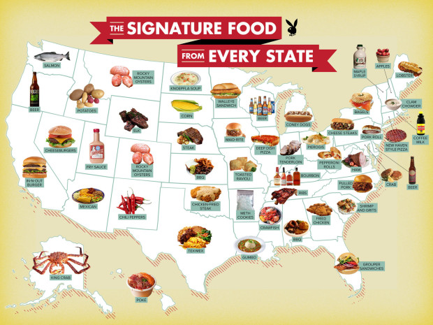
Maps are fun to look at and get easier to make every day, so there’s a lot of them floating around in the world. But before you sit down to enjoy that big, juicy map, take in some advice from geographer Andrew Wiseman to avoid looking the fool. A fool? A fool, I say.
It’s no surprise then that people often assume maps are accurate, because it’s so often unclear how they are made—maps are “arcane images afforded undue respect and credibility” that are “entrusted to a priesthood of technically competent designers and drafters,” as Monmonier puts it. Almost everybody can write, but not everyone can make a map.
Tips include: Don’t trust extreme titles, look for the data source, and note the color distributions. As is usually the case, we can piggyback on most of this advice for visualization in general.
And this of course doesn’t mean you treat every map with extreme skepticism and strip away every possible ounce of joy. Just pay attention as you read, like you would anything, written or otherwise.


