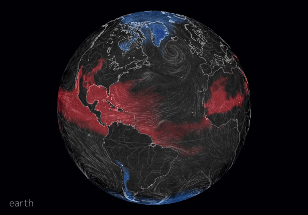
Late last year, Cameron Beccario made a wind map for earth, inspired by an earlier work by Fernanda Viegas and Martin Wattenberg. Beccario has been slowly adding overlays to the piece to show more dimensions of weather data around the world. The most recent overlay is what he calls a Misery Index, which is based on perceived air temperature.
If you’ve seen the interactive globe already, it’s worth revisiting. Click on the earth label on the bottom left to see the new stuff.


