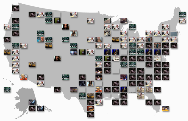
I don’t know about you, but when I go to YouTube, I check my subscriptions and then look at what videos are currently popular. Because you know, it’s important to stay up to date on the most current news about kittens, people getting caught doing weird things, and movie trailers. The YouTube Trends Map is another way to see what’s popular, but from a geographic and demographic point of view.
As you’d expect, the map shows the currently most popular video in a region, based on shares or views, which looks like a lot of noise at first. Look a little closer though, and there are some interesting spots.
For example, looking at it now, the most popular video in the 12 to 24 year old range is a clip from Family Guy. In contrast, move to the older age brackets, and the most popular is a trailer for True Blood. The most popular clip in Oklahoma City is Kevin Durant’s winning shot from Sunday’s Oklahoma City Thunder game.
Finally, the map is linked with a stacked bar view, which shows the breakdown just by demographic.

I like it.
[via @viegasf and @wattenberg]


I’m not sure what to make of this information yet, but it’s interesting that there is enough volume to change the result fairly rapidly. If you refresh over a 5 minute period it will change. Also, I’m surprised there is such a large difference between the “Shared” and “Viewed” trends.
Kinda like the difference between most viewed and most emailed on The New York Times:
http://www.nytimes.com/most-popular
Very cool, though there is actually very little geographical variation. I wonder if the location data is specific enough to identify urban/suburban/exurban, etc. which might correlate to preferences more strongly. Nice to see what the hoi polloi are up to in any case.