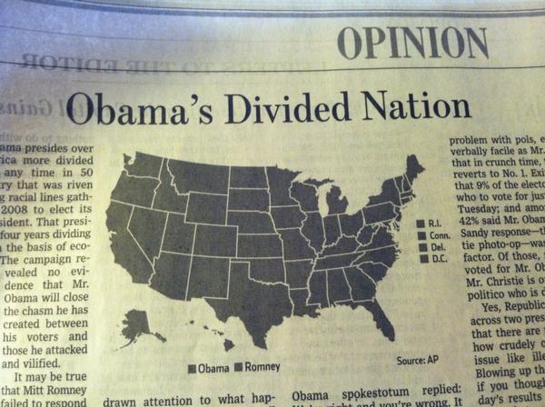
I knew things were bad, but I didn’t know they were this bad. Obama has his work cut out for him. [Thanks, @adamsinger]
Incredibly divided nation in a map


I knew things were bad, but I didn’t know they were this bad. Obama has his work cut out for him. [Thanks, @adamsinger]
I think that this image is supposed to be printed in colors…
You should double check on that.
Which great, proud pillar of journalism produced this?
There’s a second lesser laugh in the fact that even if they had printed it properly in colour, they had two separate ranges with a colour scale – candidate, and labels for small states. Don’t know how that could have worked even with colour ink.
A quick google search gave an answer with a bonus: a colour picture!
It is WSJ: http://online.wsj.com/article/SB10001424127887324439804578103470239517336.html
Hahahaa it’s coming up as ‘Exclusive subscriber content’!
You can share the black and white version for free online, but if you want your colour-coded map in colour, that kind of decadent extravagance is going to cost you.
Wall Street Journal. And to Jamie Bull’s point, the “spokestotum” appears to still be there online.
Well, if you look closely, all of the states are separated from each other.
Brilliant. Also, what’s a “spokestotum”?
There are fifty, FIFTY! different distinct entities on that map. I just don’t know how any President can unite them. Add one more, and things will just collapse in chaos.
What? Puerto Rico what?
Kind if encouraging, actually. Maybe we aren’t so divided after all!
Are you sure it’s not irony?
It is an opinion piece. You may be on to something. Hard to tell with no context at all. This was my guess as well.
I also preferred that Obama would dismiss after the election, but bad luck. People have had to re-think.
By being so incredibly one sided, the WSJ just feeds the division they’re bemoaning with this piece of terrible writing.
Even with color, I find it hard to see how a map of winner by state would show whether the nation is divided or not. Wouldn’t it be better to have a chart with votes by gender, “race”, income group, or something like that?
In the chartsnthings blog, I found a map (from the 1904 election) that truly shows a divided nation:
http://chartsnthings.tumblr.com/post/35147782890/nytgraphics-theodore-roosevelt-r-defeats
It happened to me a couple of times, specially when some editor rushed to finish the edition and forgot to tell me that the graphic was in a bw page.
Too many pieces, this jig-saw puzzle looks difficult to assemble together