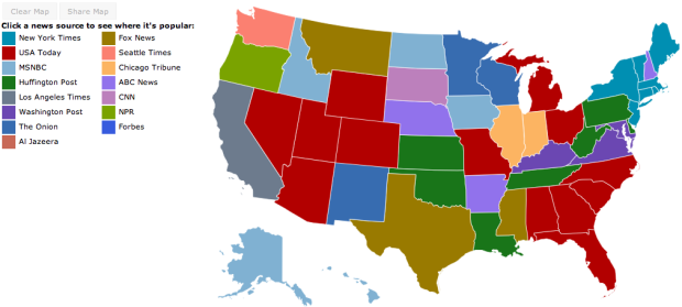
Jon Bruner of Forbes, in collaboration with Hilary Mason and Anna Smith of Bitly, maps the most popular news source by state.
Bitly’s dataset, wrangled by data scientists Hilary Mason and Anna Smith, consists of every click on every Bitly link on the Web. Bitly makes its data available publicly—just add ‘+’ to the end of any Bitly link to see how many clicks it’s gotten. For Bitly’s collaboration with Forbes, Smith and Mason looked for news sources and individual articles that were unusually popular in certain states compared to national averages. The interactive map starts by showing which news source dominates in each state by this measure: the Washington Post in Virginia and Maryland, the Chicago Tribune in Illinois, and so on.
You can also select news sources to their click distributions across the country.
I like how The Onion leads in Minnesota, Wisconsin, and New Mexico, although I’d be interested to know what other news sources the states read. A color scale might be informative, too.


Nitpick: I don’t think it’s “most popular news sources by state”; it’s just the source that is read more often in that state than it is by the nation on average. E.g. it doesn’t say people in Wisconsin are more likely to get news from The Onion than from USA Today; it just says people from Wisconsin are more likely to get news from the Onion than people from Florida are.
Sean, I wouldn’t call that a “nitpick” at all. This kind of thing happens all the time – headlines subtly twist the underlying analysis. Much more data could be conveyed by this graphic, too. Upon seeing the color for my state (I live in DC, but VA is close enough) I immediately wonder “What’s the second ‘most popular’ news source?” Maybe separate heat maps for each source (which would be all the better if the data goes deeper than state-level)? It would be a lot of separate maps to take in, but patterns would quickly and clearly surface.
With the separate views, right, but with the initial view, it shows the most clicked on source for that state. But yeah, it does come down to definition for what measurement indicates “popular.” That’s why I was interested in knowing how other news sources ranked within in a state.
Interesting map. How exactly was this data collected? I think I speak for a lot of readers when I say that I would love the chance to do something like this, but I don’t really know how to scrape sites for such data. Any suggestions, resources?
Aside: working my way through Visualize This and loving every page!
Happy to hear it, Steve. The analysis and aggregation came directly from Bitly, but they do offer an API (although not on a state-by-state level from what I can tell.)
The Forbes intro calls this “the most influential media outlets” but also admits this is collected by web-clicks and much later only by a specific type of links (if you don’t know Bitly then you may erroneously assume they have a representative sample of all clicks). Not only is Sean correct that they twist the definition of what was actually collected, the underlying data is so incomplete that it does not rise to a basic level of delivering on the title’s promise. Why not just call it Influential Media outlets among Social Media users?
Wow! I found a lot of these quite surprising. I’d like to do some fact checking on this.
The different shades of blue and purple are really hard to tell apart!
I agree with Chris — the claim that Bitly data alone could tell anyone “Who’s Reading What and Where” (as the Forbes headline claims) is very questionable. There’s no way Huffington Post is the most popular news source in Louisiana or that The Onion is in Minnesota. This is interesting data, but it’s interesting data about Bitly users and should be reported as such.
The Onion is not a news source, it’s satire presented in a newspaper-like fashion, much like Saturday Night Live’s “Weekend Update”. I assume Jon Bruner was unaware of this when he created the map. Because of it’s inclusion, we are left wondering what the real dominant news source is in Minnesota, Wisconsin, and New Mexico.
I assume one reason the Onion is so popular in Wisconsin/MN is that it was originally published in Madison.
I can’t tell the Forbes color from the Onion color. Does anyone read Forbes?
Negative.
HAHAHAHA!! I love how he casually threw “The Onion” into the mix. Too funny.