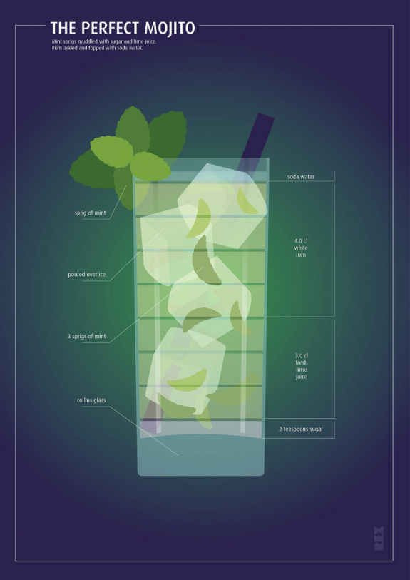
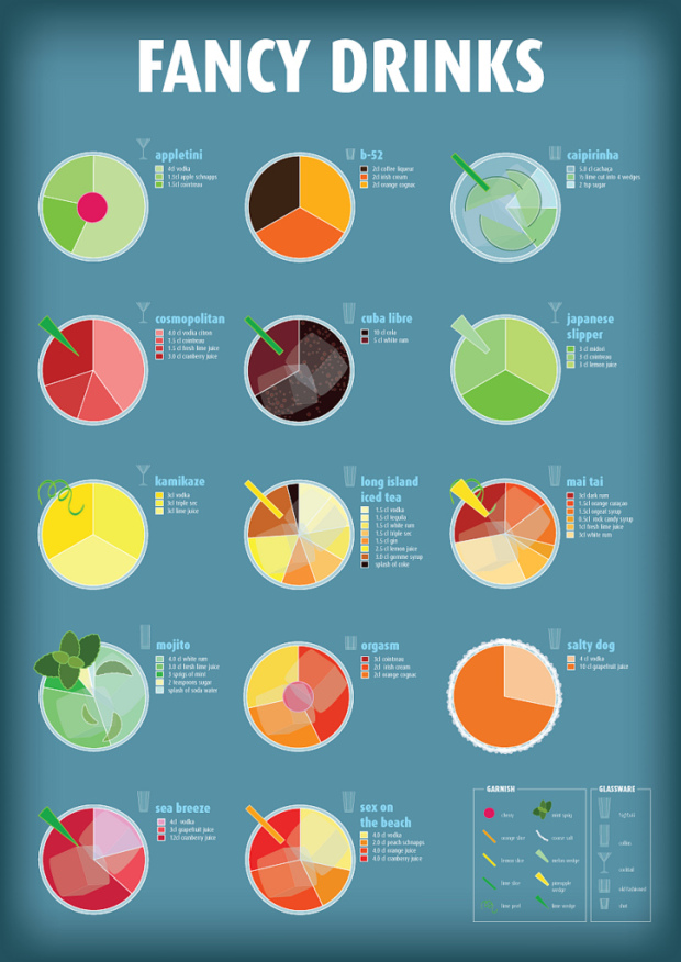
I’m partial to all things food and drink related, so naturally my eyes light up when they’re combined with charts. Fabio Rex illustrates what makes the perfect drink in a set of pie charts and annotated glasses. Below, Rex describes the perfect Mojito and above are breakdowns via pie chart of various other drinks.
This work of course isn’t unprecedented. You might remember the engineer’s guide to drinks and the citizen’s guide to coffee. And let’s not forget the original coffee breakdown.
Still though, I am sure any college student would be more than happy to have a print hanging on their dorm room wall. Have a look at the full set on Flickr.

What’re you having?


Funny!
I hate to be a stickler but if each drink contains a different amount of liquid, then shouldn’t the size of each pie chart reflect that in order to be accurate?
It wouldn’t hurt, but would it actually help you in making the drinks?
The specified glassware component in the key denotes the size of drink.
Pingback: Links 2-1-11: Google gets artsy, Readability pays authors, Gamify | Aram Zucker-Scharff
Pingback: girlie drinks, illustrated | 香港新媒體協會
Where can I buy one of these posters?? Please let me know, thanks :)