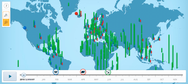
Google recaps search trends for the year in Google Zeitgeist 2010, from the World Cup and the Olympics to the earthquake in Haiti and the BP oil spill. Above is relative search volumes around the world during the ash cloud in Iceland. You can browse the interactive map, or use the timeline to watch changes over significant events during the year.
A video (below) also accompanies the interactive, showing how the physical world and digital are melding ever so nicely.


Does someone have info on what kinds of tools/technologies were used to create the map?
Hey VK — I built the map. It’s all JavaScript and it makes use of CSS transitions for the animations when possible (with standard JS animation fallbacks). Uses a JSON object for the data and language strings.
It’s got a really neat design and all, but somehow it seems a little depressing that our top searches are all so meaningless. Chatroullette?! We have available enough computing power to solve any problem that we can throw at it and we’re just interested in chatting and Justin Beiber or whatever. I’m going to go eat a case of twinkies and pray for death
Pingback: 今年の出来事を3分で(Zeitgeist 2010: How the world searched) : monogocoro ものごころ