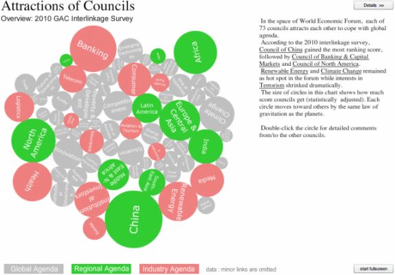
This past month, the World Economic Forum convened in Dubai to discuss issues on the global agenda. There are about 700 members who belong to 72 Global Agenda Councils. Before the forum, these members were asked to rank the top five other councils that his or her’s own council would benefit the most from interacting with. This data was made available for the WEF data visualization challenge.
I made a weekend project out of it and got an honorable mention (darn). This is my entry.
Keeping it simple
The survey involved a set number of groups potentially interacting with each other, and it was actually called the interlinkage survey. So I knew there were going to be a lot of network diagrams, especially since the data were structured in a way that sort of encouraged that format. Plus the initial example was a circular network.
I’ve never been much of a network person. All the links and nodes scare me. I’m not saying they’re bad, but it’s hard to get it right, so I left that option to those more skilled than me.
I thought of the council members as the audience, who I imagined to range in skill level with visualization tools and probably computers in general. So I felt straightforward was the best direction. I wanted to show as much as possible with as little as possible, so that the people who made trips from all over the world could look at the data quickly, and then get down to business.
Focusing on what’s important
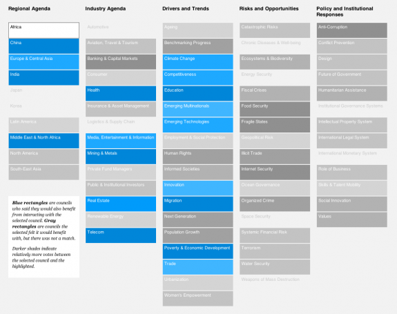
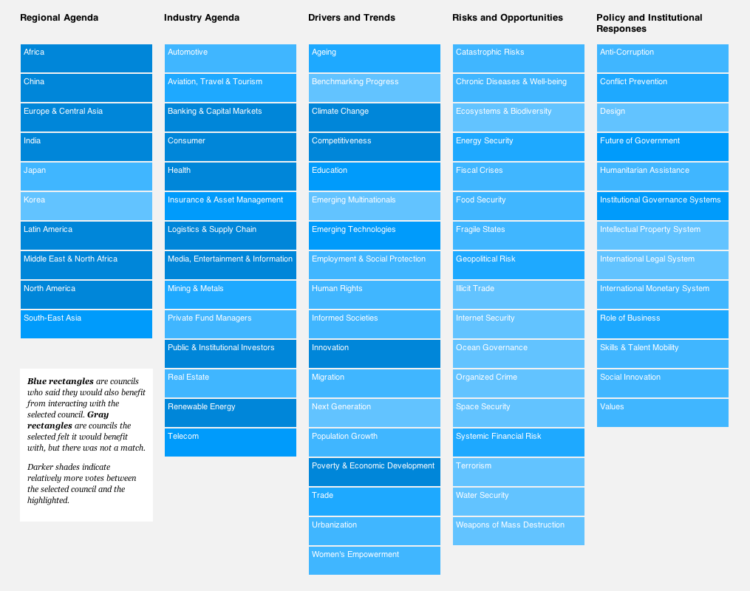
The point of the survey that struck me as most important was getting councils and people to work together. The obvious thing to do would be to show the top councils that each council chose. For example, if you selected the Education council, the visualization could highlight the councils that members in Education chose.
But there’s one part missing here. Collaboration can’t happen successfully between two groups if one group doesn’t think it’s worth working with the other. It’s mutual connections that are more important.
Council A and B both think they’d benefit from working together. Ding. That’s a match.
So that’s what I did. The darker the shade of blue, the stronger the mutual picks between the two councils. Shades of gray indicate one-way connections.
For example, if you select the Africa council (shown below), you can see that a lot of members from other councils ranked Africa, but Africa members ranked education, health, etc as most important.
Give the tool a try here. You can see the winner and other honorable mentions on Visualizing.org. Congrats to all.
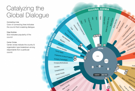
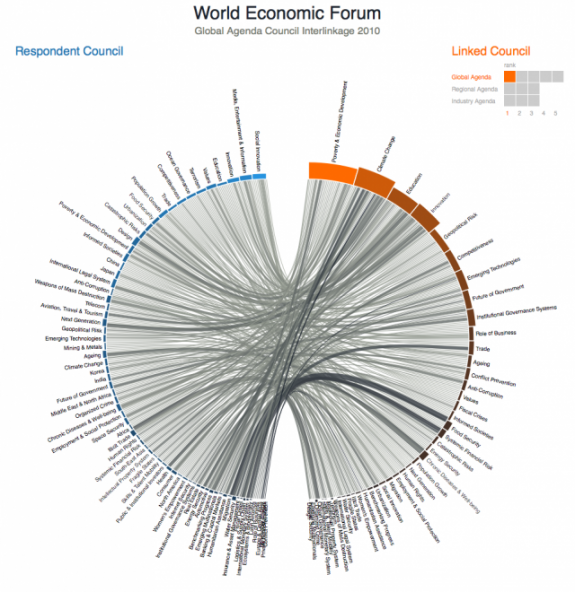
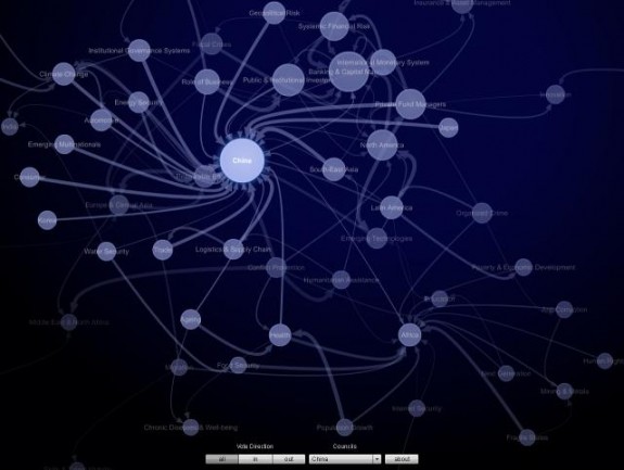


I like your contribution a lot, congratulations! Here is my approach: http://www3.weforum.org/tools/gac/issuebrowser2010/index.html (not in competition)
Thanks, Moritz. Nice set of slides there yourself.
Nathan, I really liked how your grey rectangles answered a question which wasn’t obvious from the start. Most other entries concentrated on showing strong connections, with this approach you show connections which are not there and which should have been.
for instance if you select internet security, only “media, entertainment and information” – where piracy is big on their agenda would like to collaborate with them, and none of the other councils, although they would like to work with Africa, China, Central Asia etc.
likewise, there’s no love for “space security”.
Thanks, Jerome. I really wanted to focus on those two-way connections, or lack of them, so I’m glad that’s what you took away from it :)