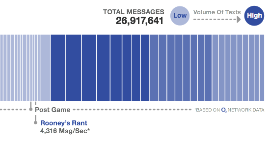
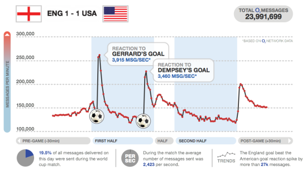
I love how major sporting events can captivate an entire country or region, especially when there’s the data to show the collective pulse. We saw it during the Canada-United States hockey gold medal match. Everyone flushed together. Similarly, O2, a UK mobile service provider, shows us texting volume during the World Cup and highlights the points of interest. England scores a goal and there’s a flood of text messages. Goooal.
They’ve got post-game too. There’s a burst of messages after Rooney’s rant:

Check out the full PDF versions: England vs USA, England vs Algeria, and England vs Slovenia.
Update. Here are the time series versions: England vs USA, England vs Algeria, and England vs Slovenia


I find the bars quite unhelpful, colour coding alone would be easier to sea the peaks and troughs, but a line graph would be the overall clearest approach.
Incidentally, who the hell is Robson supposed to be? Is that Rob Green’s Sunday name?
You comment. They listen.
Pingback: SUPERMETRICITY – writing about strategic design in New York » Voice Pushtone Mobile App for World Cup
Visualizing real time data is so interesting. We just launched an app that alerts you of every goal in the WorldCup. You can then taunt your friends by sending a message to their facebook wall. We’re really looking forward to wading through the data once we’ve got some uptake to see how the responses vary depending on who scored etc.
Pingback: Texting volume during World Cup matches | SportsEnvoy
Pingback: RadarLake » Hypercarnivores, texting, the moon and Douglas Adams
Pingback: SUPERMETRICITY – writing about strategic design in New York » Turn up the Volume