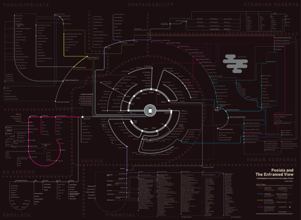
Ben Millen diagrams the reach of the iPhone in our everyday lives:
These are not maps in any conventional sense, but rather diagramatic representations of the interconnected space of technology, capital, instrumental value, exchange value, social and environmental impact that surround the device.
The tube map metaphor is a little worn, but this is subtle, so it’s not so bad. There are two maps. One covers the mechanics of the phone while the second is more about how consumers use the phone. The former is the more interesting one.
So who’s going to do the map for my 2004 Samsung flip? It takes a lickin’ but keeps on tickin’.


