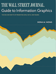
Add another book to the growing library of guides on how to make information graphics the right way. Dona M. Wong, former graphics director of The Wall Street Journal and now strategy director for information Design at Siegel+Gale, provides the dos and don’ts of data presentation in The Wall Street Journal Guide to Information Graphics.
First Impressions
Given Wong’s background, you can make a pretty good guess about the examples used. They’re not graphics from The Journal but they do look a lot like them. The book description also makes a point of highlighting that Wong was a student of Edward Tufte, which was a big hint on what the book is like.
The guide is on the smaller side at about 150 pages of content, but it’s mostly a visual book. There is about as much text as there are graphic examples, which I like.
Data Presentation
Going a little deeper, the type of examples provided are a lot like what you see in newspapers. There are lots of time series plots, bar charts, and a little bit of mapping along with some other graphic types that you’ll find in The Journal (e.g. org chart, timeline). Wong covers a lot of the details like axes, proportions, and proper math. Common pitfalls and misconceptions are also covered.
It was particularly interesting for me, because a lot of the stuff in the book I’ve just learned from experience. I don’t really think about these things much and do a lot of eyeballing, so it was kind of weird for me (in a good way) to see specific directions on what to do. I can easily see how this would be useful to beginners, especially for those who have to make a lot of charts and graphs for reports and presentations. Not so much for data exploration.
Straightforward Guide
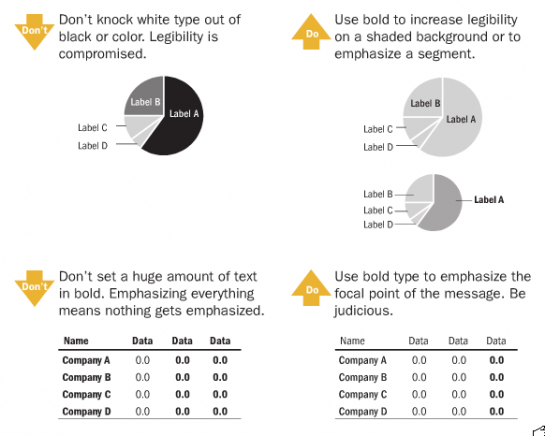
The best thing about the guide is that it’s essentially a whole bunch of straightforward examples. It doesn’t go deep into theory or get sidetracked by the history of information graphics. It’s page after page of dos and don’ts and really direct statements about what to do and what not to do.
Here’s a page to give you an idea:

Bottom Line
The Wall Street Journal Guide to Information Graphics is all about fundamentals. So if you’re new to data and information graphics, this is a good book to learn from. You have to learn the basics before you get into more advanced graphics.
I have one piece of advice though. There are a lot of bullet point rules in this book, which I think are great when starting out. The rules aren’t set in stone though. Just like when you learn grammar in grade school, graphs will vary case-by-case, and once you got the fundamentals down, you’ll learn what rules you can break.


“Don’t knock white type out of black or color” unless you’re putting the word “don’t” in a yellow arrow?
Do as I say, not as I do, apparently. Perhaps the example chosen for the review was deliberately ironic…
@SW – hehe, i appreciate you giving me the benefit of the doubt. i’m not that clever though :). the yellow-ish arrow is actually not as bright in the book and much more legible.
by the way, i got that shot from scribd where you can see a few more pages:
http://www.scribd.com/doc/14992717/The-Wall-Street-Journal-Guide-to-Information-Graphics
I would be interested in seeing a list of other books you recommend as a good starting point and perhaps for more advanced topics. I’m familiar with Tufte, of course (who isn’t?) but I’m always interested in finding something new.
I second Rob’s suggestion!
I kind of question WSJ’s advice on making information graphics after seeing this: http://img.waffleimages.com/faadd6bb46d9241654c63b7cce575ae7843e4306/wsj1.png
“Look at how defense spending has hardly change, but Medicare spending is soaring upward. Please just ignore the fact they’re on totally different scales.”
Sorry, bad link, http://tinyurl.com/y8gzpzf.
@Darrell – that link didn’t work either..
Pingback: Data Research « Data Visualization: Topics in Graphic Design
In this book, Dona boils down all of the theory from Tufte’s work and turns it into useful and practical guidelines for information display. If you’re looking to develop guidelines for your company’s charting and information graphics, Wong’s book is an absolute must-read.
I thought pie charts were an absolute no-no in the book of Tufte? I don’t care what colour or boldness the labels have, they’re still evil!!!
It is a shame a book like this “doesn’t go deep into theory or get sidetracked by the history of information graphics” because i think there is a gap in the literature about a critical theory of infographics. Tufte’s work is useful, but there are a set of epistemological questions about the use of information in infographics which need to be addressed if the field is to do anything more than describe information in a graphical way. I’m particularly thinking of third parties with little understanding of research methodologies creates a graphic from data they didn’t collect or process. There are reasons why pie charts are evil and why they aren’t used by, for example, academics. They look nice, but can lead to misinterpretation of figures, especially when circles are used to compare numbers by relative area.
Pingback: Infographer » Пособие по информационной графике от Wall Street Journal