A couple weeks ago, FlowingData ran another Visualize This challenge. I posted a dataset on the number of days it takes the average person in each state to pay his or her taxes and asked you to visualize it. The number of days vary, because tax burden varies state-by-state. The day all taxes have been paid is dubbed Tax Freedom Day. Alaska has the earliest Tax Freedom Day while Connecticut has it last.
Here are the interesting results you all came up with. Thanks to those who participated. Nice work all around.
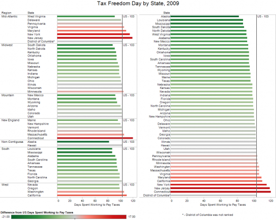
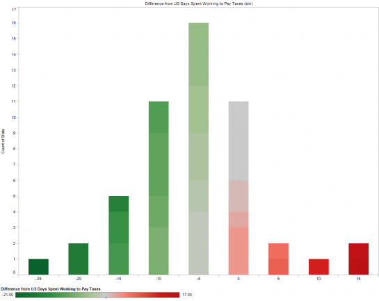
Joe Mako used Tableau Software to create an interactive dashboard:
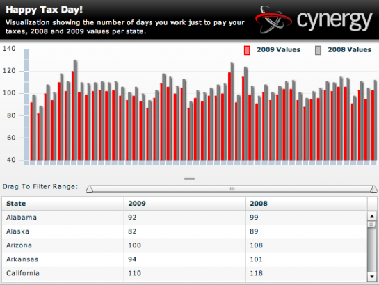
Andrew threw together an interactive Adobe Flex based visualization:
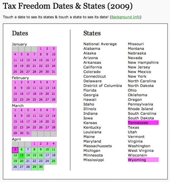
Annie took a different route with an interactive calendar interface. This was definitely one of my favorites, partially because of the smooth interaction and partially probably because I wasn’t expecting it:
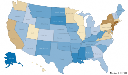
Frank went with a map on Many Eyes, the online application that promotes social data analysis:
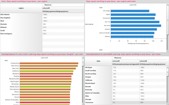
Rachel, from bime, used the Tax Freedom Day dataset to test their online dashboard tool:
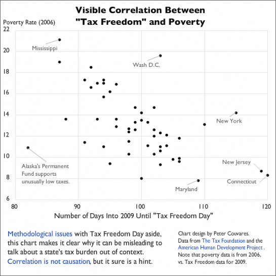
couvares from Verifiable, another online data analysis toolset, put this one in:
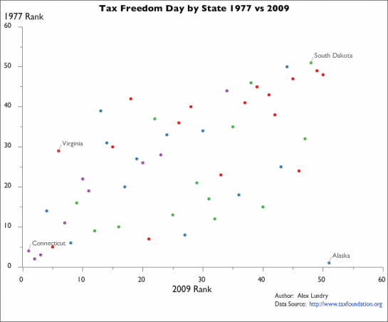
Finally, Alex, tried out a couple of readily available online applications to visualize the dataset, one with Verifiable and the other with UUorld:

 Visualize This: The FlowingData Guide to Design, Visualization, and Statistics (2nd Edition)

I think I liked Joe’s Tableau bar charts best. Clean, crisp, easy to absorb the information. Amazing how the simplest of charts (bars or lines) are the best at getting the ideas across clearly.
Andrew’s Flex bar chart was not as easy to use as Joe’s. The bars were sorted by state name, not by value, and the shadows under the bars made me feel I was seeing double. If the bars were rotated, you could use the state names as vertical axis labels. But then it would be the same as Joe’s.
Annie’s calendar was an interesting approach; I mostly liked it. Its weakness was that you could only see one day’s worth of states at a time, so you have to mouse back and forth a few times to see any patterns. Also, if the whole calendar didn’t change colors when one date is highlighted, it would be nicer on the user.
Frank’s chloropleth was, well, I like chloropleths. If the actual number of days is added to the mouseover labels, it would be nearly perfect.
Rachel’s dashboard was a good rough draft. The equal sized quadrants do not contain equal amounts of data. The bottom left chart should be combined with the bottom right table, and given half of the display, say the left half. The upper two quads could also have been combined, again using the tabulated data as data labels. The unemployment color scale was backwards, since usually red represents bad (high for unemployment) and green represents good. A scatter showing tax days vs. unemployment may have been interesting.
Peter’s scatter chart was interesting, a good attempt to correlate taxes with another economic variable. Color coding by region may have added further insight.
Alex’ scatter chart was also nice, correlating two economic paramteres. The color coding worked nicely, once I figured out what the colors represented (no key anywhere). The label for Connecticut prevented mousing over the red point under it.
The prismatic map was, well, I strongly dislike prismatic maps. They are hard to read, and the tall prisms obscure the shorter ones behind them. Rotating the map to show all sides is disorienting and dizzying.
Just my 20¢ (10 time 2¢).
@Jon
Agreed that Joe’s work was the cleanest, easiest to use, very flexible, and, quick. True to the Tableau model, it also illustrates the “Zen of Visual Analytics”, and respect for the realities of human visual perception and pre-cognition. It looks like Joe used Tableau defaults for the kind of analytic visualization suggested by the data, which speaks well for the tool.
Great work!
Jon, thank you for the complement :) Tableau made it easy. Thanks also goes to you Jon, for your writings on how to effectivly communicate information with simple graph elements.
I thought the first chart (national) with the tax date and the date adjusted for the deficit as well as the chart with the poverty rate vs. the tax date were by far the best because they forced comparison of different things and suggested a relationship. In both, the suggested relationship itself (e.g. earlier tax freedom day and deficit spending during a recession including the magnitude of the gap in 2009 from the first chart and the hidden costs, perhaps, of an earlier tax freedom day as well as outliers from the second chart) was front and center while the data themselves were in the background. Some of the others may be clearer and prettier than their peers, but none seems substantially better than a data table to me. The only relationships they looked at were geography and time, and in both cases there is little explanation suggested.
I wouldn’t follow this site if I didn’t love data, visualization, and graphics, but in the end it has to be about the story behind the data. The two I cited I feel tell a much better story than the rest.
Pingback: Visualizing State Taxes in Number of Days Worked | Megan Taylor: Web Journalist
My comment on the tax freedom vs. poverty graph:
This is a creative look, but I think the data has a significant internal correlation. A substantial factor determining the tax freedom date is the mean (weighted) federal income tax rate, which in turn is driven by personal income levels (higher incomes lead to higher aggregate marginal tax rates). So, all else equal (let’s pretend for a moment that all states have the similar Gini coefficients), states with later tax freedom days tend to be higher income, so it’s not so surprising that they mostly have lower poverty rates.
So, if that’s true, the really interesting thing here are the outliers. This would suggest that NY, CT, DC, and NJ have relatively less wealth distribution, because they have relatively high poverty rates relative to their relatively high income levels (as indicated by their late tax freedom dates).
A refined effort might want to look at state tax rates (plus or minus net federal inflows) vs. poverty, if the goal is to compare state policy (using tax rate as an indicator) vs. poverty rate.
The calendar is pretty cool, but Massachusetts is spelled wrong! The ignominy!
@BCC, oops! I fixed it on the site. I’m only human ;)
@Annie – That’s no excuse!
I like them all. Probably my favorites are Joe Mako’s, Annie’s and Frank’s.
Sorry I missed out on the challenge, I hope to catch the next one.