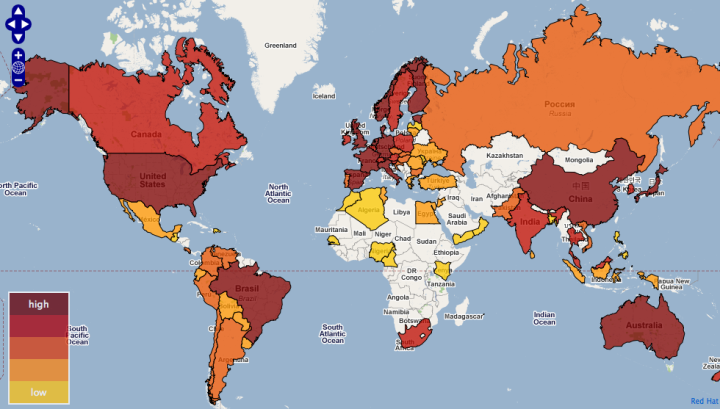
Red Hat, an open source leader best known for their Linux distribution, maps open source activity around the world. If you’re not a developer or involved with Web-ish things, open source might seem like a foreign concept. Give away your code, your work, and your data. And succeed? I don’t know how it works, but somehow, it does. Open source not only helps an application flourish, but also helps ideas develop further than they ever would with a single group. Plus – it makes my life, and many others’ lives much easier.
Is Your Country Involved in Open Source?


raw data here:
http://www.reddit.com/r/opensource/comments/8e6um/the_red_hat_open_source_index_compares_and/c090tvp
I am surprised India doesn’t lie in the ‘High’ category. Open source is pretty huge in India.
Funny, no data on Cuba. I’ve read they have their own distro…
Could they have picked a more distorted map projection for their chloropleth?
It’s a google mashup. What do you expect?
What happened to poor old New Zealand on your map?
Well said Jon P. In another mapping visualisation, somebody revealed they believe Africa and Greenland to be of similar size because that is how google map shows them. Africa is 15 times the size of Greenland if anyone is interested.
Flat projections distort the size of real geography, in particular near the poles. News at 11.
I don’t know where RH gets its data from, but some of it is highly suspect. Israel is one of the largest per-capita OS contributors, for instance, not the white wasteland depicted here. Other odd instances are New Zealand and Alaska.
Overall, though, you could probably use this map as an overlay for economic development (no Africa) and civilizational development (no Moslem world). Interesting.
Hon Wei,
Please come and teach us Muslims how to be civilized. As a Saudi I’m lost without out your guidance. Luckily for me a civilized person is translating my uncivilized rant into coherent sentences. Well, time to go back to being uncivilized with my fellow countrymen…
Thanks for generalizing and interpreting this map to your biases; it really helps to build bridges of understanding. :)
Pingback: Red Hat’s open source map | The Evolving Newsroom
Pingback: España, el 2º paÃs del mundo en desarrollo de software “open source” | Comunidad en la Red
Newfoundland should be changed to the same color as the rest of Canada.