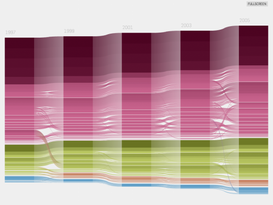
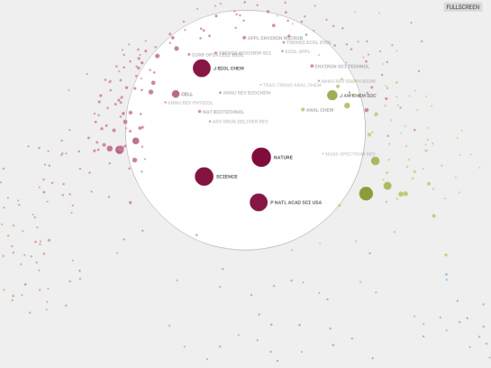
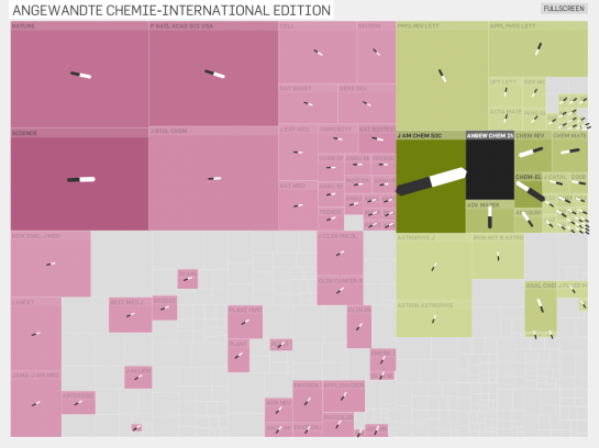
The Eigenfactor Project and Moritz Stefaner collaborate in these interactive visualizations “based on Eigenfactor Metrics and hierarchical clustering to explore emerging patterns in citation networks.” Yeah… or in other words, this series of four visualizations – radial diagram, stacked, clustering, and network map – explore journal article citations.
Why you ask? Well the Eigenfactor Project aims to measure the “importance” of journal articles and the metrics are largely based on citation patterns. Here are a few more shots:


The stacked graph variant and network map are a little slow, but still good. If anything, the collaboration is an excellent example of what you can do with Jeffrey Heer’s Flare Visualization Toolkit.
[Thanks, Moritz and @Edial]


Pingback: Flowing Data - Ranking & Mapping Knowledge | Vector One
I like that first circular map. It’s relevant to something we’re doing right now. I can’t read all the labels – what is” …mental chemistry” on the left and at the bottom – “molecular…”? And the one between ecology and evolution and molecular – I can’t read at all. Thanks very much.
Check out the actual site, and you’ll be able to see the labels much better. You can view it fullscreen.
That’s better, but the words I’m interested in are cut off the graphic. Thanks Nathan.
Pingback: Hot visualizations from The Eigenfactor Project. via Flowing… — Some Random Dude
Pingback: dekay.org » links for 2009-02-07
Pingback: Visualizing citation networks | Implicit None
Pingback: YACGV: Yet Another Colorful Graph Visualization « Mike Love’s blog