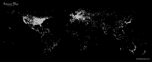
Chris Harrison put together a series of Internet maps that show how cities are interconnected by router configuration. Similar to Aaron Koblin’s Flight Patterns, Chris chose to map only the data, which makes an image that looks a lot like strands of silk stretched from city to city. With these maps, viewers gain a sense of connectivity in the world – and as expected the U.S. and Europe are a lot brighter than the rest.
The Dimes Project provides several excellent data sets that describe the structure of the Internet. Using their most recent data at the time (Feb 2007), I created a set of visualizations that display how cities across the globe are interconnected (by router configuration and not physical backbone). In total, there are 89,344 connections.
Here’s the density map:

Taking Context Into Account
Chris’ results are pretty, but my favorite bit is his explanation of the data. He explains that the data does not represent usage – there could be a lot of people who use single connection at an Internet cafe.
Chris also clearly states that he took an aesthetic approach over an attempt to create a utility (although I imagine this could be a nice framework to do so, with a bit of tweaking). One of my biggest pet peeves is when I see design pieces that claim analytics and utility when they clearly don’t know what they’re talking about. Good job, Mr. Harrison.


Disappointing how it gets to the eastern edge of ND and there’s a dropoff in connectivity.
Awesome. I definitely noticed the similarity/parallel to the Flight Patterns visualization.!