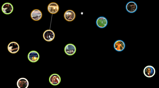
YouTube (or should I say Google), released their visualization for related videos. It’s essentially a ball and stick graph without the sticks. The above is a screenshot of the videos related to Marty McFly playing Johnny B. Goode in Back to the Future, the greatest movie of all time.
Some of the video bubbles that circle around the Marty clip are the same as those in the “Related Videos” section of the usual page while others are not. Place the cursor over a bubble for about two seconds, and related videos for the one you have your mouse over will bubble up.
I’m not sure if the distance between the bubbles have to do with similarity level. So far it seems not, because I’ve refreshed the Marty visualization a few times and the bubbles’ initial positions have always been different.
Take a Look for Yourself
If you want to see the bubbles for yourself, go to some YouTube video and go full screen. Look for this ball and stick button next to the play button:
![]()
It’s not available for all videos yet, so you’ll have to look a little.
What I Think
It’s good that Google is trying to get into some visualization. When Google starts doing something, you know others will follow. When others follow, visualization will popularize and as a result, I will be in higher demand when I graduate. That’s in the grand scheme of things though :).
The YouTube visualization itself — I’m not all that impressed. It’s kind of sluggish, it’s not very attractive, and it gets pretty confusing a few seconds in. However, when we think visualization, we always have to think context. When I think of the type of people who are going to be using the tool (if you want to call it that), it’ll probably achieve its goal — get people to watch more videos and stay on YouTube longer.
[via ReadWriteWeb]


