Most are familiar with the Netflix Prize. If you’re not, Netflix has offered a one million dollar prize to whoever improves their movie recommendation by a certain amount. It’s been going on for a little over a year with still no grand prize winner. The dataset is 100 million ratings.
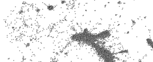
The above is a visualization of the Netflix dataset. Each dot represents a movie, and the closer two dots are the more similar the two corresponding movies are based on Netflix ratings. I’m guessing the orientation of the dots was decided by some variant of multidimensional scaling.
It’s kind of fun to scroll over the clusters. Like in the bottom right we see Babylon 5, Buffy the Vampire Slayer, Alias, and Battlestar Galactica clumped together. The giant blob in the middle, however, is pretty useless; it’d probably benefit from some zoom functionality.
The Need to Explore
I’m kind of surprised that I haven’t seen more Netflix visualizations like this (or ones better than this), because I’m pretty sure it would help see some relationships that typical analysis won’t provide. I was browsing the forum and saw someone ask if others had had success loading the 100 million observation dataset into R. Silly undergrad.
A computer scientist, designer, and statistician walk into a bar; they discuss how they would boost the Netflix recommendation system. The punchline is that they win a million dollars, but I’m not sure what happens in between.


That’s awesome! I wonder what software they used to do that…
It may be MDS, but it might also be a graph representation using weighted (different length) edges and a particular vertex ordering.