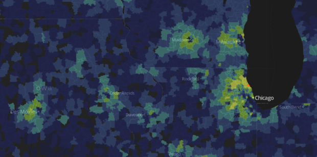
The Washington Post looked at Super ZIP codes, a classification based on household income and education levels. It’s a featured story, but it leads off with an interactive map so that you can see the ZIPs you’re interested in.
The ranks, ranging from 0 to 99, represent the average of each Zip’s percentile rankings for median household income and for the share of adults with college degrees. Super Zips rank 95 or higher. This approach is adapted from one used by author Charles Murray.
The map at top shows the nation’s 650 Super Zips. Among them, the typical household income is $120,272, and 68 percent of adults hold college degrees. That compares with $53,962 and 27 percent for the remaining 23,925 Zips shown. Only Zips with at least 500 adults are displayed.
I wonder what you get when you look at just education alone. Does it look the same? And, as usually is the case with these sorts of studies, how does cost of living play a role?
 Visualize This: The FlowingData Guide to Design, Visualization, and Statistics (2nd Edition)