When you look for overall trends, you often poke around the data in aggregate, but when you zoom out too far, you could miss details or within-category variation. Sometimes when you zoom in, you see a completely opposite trend of what you saw overall. This is known as Simpson’s Paradox. Lewis Lehe and Victor Powell explain in a series of small, interactive charts.
Why does this matter?
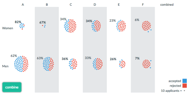
Simpson’s paradox usually fools us on tests of performance. In a famous example, researchers concluded that a newer treatment for kidney stones was more effective than traditional surgery, but it was later revealed that the newer treatment was more often being used on small kidney stones. More recently, on elementary school tests, minority students in Texas outperform their peers in Wisconsin, but Texas has so many minority students that Wisconsin beats it in state rankings. It would be a shame if Simpson’s paradox led doctors to prescribe ineffective treatments or Texas schools to waste money copying Wisconsin.
The takeaway lesson: Remember to look at the details. [Thanks, Victor]
 Visualize This: The FlowingData Guide to Design, Visualization, and Statistics (2nd Edition)