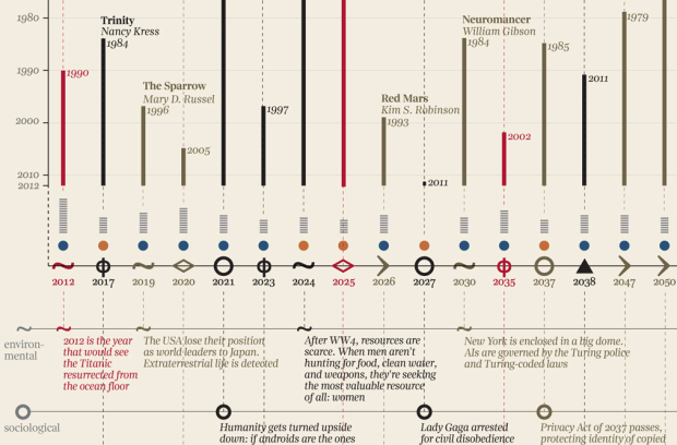
After seeing a timeline on future events as described in novels, designer Giorgia Lupi put it in visual form.
Basing on speculative fiction captions collected by Jane Hu, the visualization analyses 62 foretold future events. For each event the visualization highlights typology (are they mainly social, scientific, technological, political?), year of the prediction, genre of the book and age of the author, while dividing them into positive, neutral or negative events. In the end, good news: in 802,701 the world will exist and everything will be more or less ok.
The vertical bars represent how far in the past a future was described, icons in the middle represent type of event, and the rows underneath provide descriptions of said events.
The sheer amount of fiction makes this a fun one to look at. Although, I wish Lupi spaced events by time instead of just listing them in chronological order. I mean, it’s a giant graphic already. Might as well go all the way with the timeline framework.


 Visualize This: The FlowingData Guide to Design, Visualization, and Statistics (2nd Edition)

I agree, fun to watch, but somehow I get the feeling that there are less complex solutions for the data. What does the designer actually want to tell me?
Some of it is still in Italian.