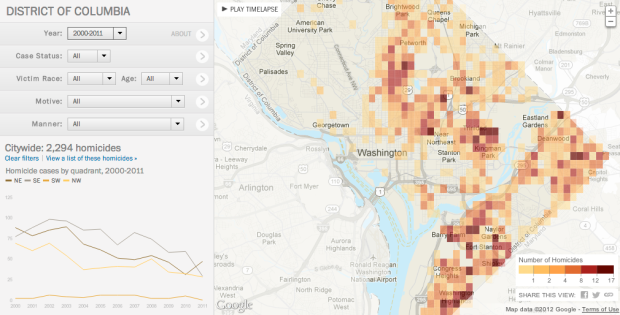
In a multipart special report, The Washington Post investigated homicides in the nation’s capital between 2000 and 2011.
A Washington Post review of nearly 2,300 slayings in the city between 2000 and 2011 found that less than a third have led to a conviction for murder or manslaughter, although the numbers have improved in the past few years. More than 1,000 cases remain unsolved.
In a 15-month study, The Post individually tracked every homicide in the District between 2000 and 2011 to learn what ultimately happened to each ensuing case. Such studies, known as longitudinal, are not generally produced by law enforcement, because they are considered to be too time-consuming.
The interactive portion of the report lets you see the data from a number of angles. The focus is on the map, which shows an overview of homicide count and then individual cases as you zoom in to neighborhoods. Navigation on the left lets you filter by case status, race, age, motive, and manner, and the display on the bottom left changes as you change queriers or select different parts of the map. You can also play a time lapse, and the map updates for each year.
There’s a lot to look at from different angles, and especially if you live in the area, the feature is worth a closer exploration.
As a side note: The Post graphics team seems to have upped their game as of late. I’m not sure what they put in the water over there, but I hope they keep drinking it. [via Source]


It’s bad HTML practices all over. Why did they feel it was necessary to break built-in controls and reinvent the drop-down menu? Why did they use a Link for something that semantically is indicated by a Button? Things like that drive me mad.