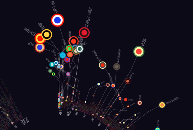
With The Avengers coming out today in the US, artist Jer Thorp had a look at character appearances, of which there have been 127 since 1963.
We can see a big cluster of major Avengers appearing in the first few episodes, with some other big names coming in the next few years (Vision, the Avenger with the 3rd most appearances in issues, doesn’t come along until #57). While there are a couple of major additions along the way (She-Hulk & Photon in 1982), we can see that the cast of characters for the team is defined pretty early.
See Thorp’s post for additional categorizations such as gender balance and robot characters. Best enjoyed in high resolution.
 Visualize This: The FlowingData Guide to Design, Visualization, and Statistics (2nd Edition)
Everything is a circle. And if it is not, we draw it as OPEN circle. Isn’t that clever?
Why is the timeline drawn in a circle? Do the colors of the targets mean anything? Why is the “flag” for each character bent? If the flags are going to be bent, why not do so so that the names of characters aren’t overlapping? Bending the flags actually puts the characters out of order, since your eye is drawn to ordering them by the big targets, not by where they connect back to the timeline. If the size of the circles represents appearances, why not keep the names the same size so that they are legible? Why use a three color target for each character? With over 20 colors used, that is over 8,000 unique targets, are there really that many characters? Wouldn’t a two color target suffice to give each character a unique symbol? Why are there gaps in the stacked targets of which characters appear in each episode? If each row represented a given character, then a gap would show where they did not appear, what do these gaps show? Why represent data graphically if the viewer can hardly gather any information, trends, or knowledge from any of the graphics?
The author starts off talking about “the power of visualization to help us understand things” and then produces “an overlapped plot that doesn’t really tell us much”, a radial line that is “not too helpful”, and then has to narrate what we are supposed to glean from the rest of the charts, but at least it “isn’t just dots or boxes”. It ends with “‘Nuff said.” How about enough shown and little needing to be said? Isn’t that the point of data visualization?
Hey Jonathan ( & Jens),
I posted the radial versions of the graphs because my blog is limited to images 550px in width. There are 570 issues of the Avengers, so if I wanted to show them all, my character icons would have to be less than a pixel wide. You’ll notice that there are horizontal timeline versions of the radial graphs also posted, though they’re pretty hard to see at that 550px size.
I chose three colours to represent each character because I felt that was the right number to pull the distinctive signature of each hero out. For instance, Captain America is obviously Red, White and Blue. Captain Marvel, on the other hand is Red, Blue, and Yellow. Thor is Red, Blue, and Gold. While I could have arbitrarily assigned them colour pairs, the three-colour versions ended up (in my opinion) working a lot better. Plus, if you had to pick a single icon out of the Avengers mythology, it would be Captain America’s shield, which these little spheres definitely speak to.
Pretty much everything else that you’re complaining about is an aesthetic decision that I made – ie. overlapping circles & bent lines. I didn’t do this project for a magazine or a newspaper or a journal – it was a fun way for me to dig through data that has a lot of personal meaning. I’m an artist, and I (*gasp*) like to experiment with aesthetic – that means, very often, being messy and breaking rules on purpose. Put another way, the intent of these graphics isn’t solely clarity, which I know probably makes you itchy just thinking about.
I learned a lot from this exercise, and I’m sending a few prints to the 10-yr old who inspired me to have a little bit of fun – which I’m pretty sure he’ll be chuffed about.
Anyway, I really appreciate the criticism. I’d love to see how you would interpret the data – I’m going to post everything (source code, raw data, API hooks) to GitHub later this week.
Best,
-Jer
@Jonathan — I think you missed the point.
@ nathan – Yes, I missed the point.
@blprnt – I apologize for being overly critical. Thank you for responding so graciously. I was wrong, your work does lend understanding to the data, my brain was just on the other end of the spectrum this morning. I’m not usually such a linear thinker. Not knowing much about Avengers, other than the most well-known characters, I clicked on the link hoping to find out stuff and with a very info mind set, and what you did was very beautiful – aesthetic – personal – and fitting within the constraints that you had to work with.