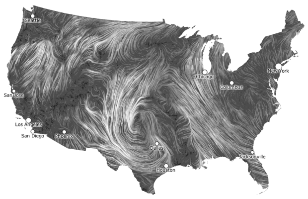
I get kind of giddy whenever I see a tweet from Martin Wattenberg and Fernanda Viegas. They rarely tweet, but when they do it’s usually because they’ve released a new project and they always announce it simultaneously. Their latest piece shows live wind patterns, based on data from the National Digital Forecast Database. It’s beautiful to look at.
The most impressive bit is that, despite all of the animation, it’s interactive. Roll over flows for wind speed and direction as well as zoom (with a double click) and pan to your area of interest.
 Visualize This: The FlowingData Guide to Design, Visualization, and Statistics (2nd Edition)
Thanks for sharing! Those are fantastic. I’m forwarding immediately to my meteorologist friends.
How beautiful.
Looks good – can anyone guess, what software/setup is used here to visualize this?
Looks a like a processing sketch to me, but the amount of data would slow it down too much, right?
Any ideas?
It seems like processing to me also. I don’t think it’s too many particles actually. Notice that when you zoom in, more particles appear and then when you zoom-out there is a brief time of no particles. They are pretty clearly not calculating what you don’t see. None of the particles are performing calculations on each other. They likely have another system grabbing the data and then calculating the ‘path’ and just letting processing render it.
Its just a guess though.
JavaScript
You may find it odd but the wind patterns visualization reminded me of a new (and surprising!) digital tribute to Van Gogh:
“Starry Night” Interactive animation
Video:
App Video:
App ($1.99): http://itunes.apple.com/us/app/starry-night-interactive-animation/id511943282
Best regards from Portugal!