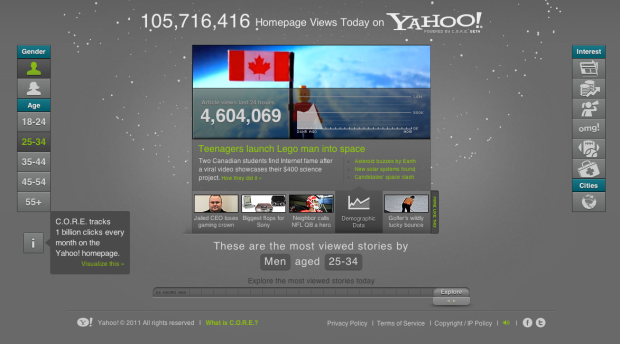
Yahoo is not what it used to be, but many parts of it are still alive and well. In a follow-up to their email interactive, Yahoo, along with visualization firm Periscopic, explores the popularity of articles that appear on the Yahoo homepage. It’s a visualization that shows activity within the Content Optimization and Relevance Engine (C.O.R.E. for short).
The focus is on the center, which has the same layout as that of the stories on the Yahoo homepage. Story on top, and links to more stories on the bottom. Except in the interactive, you can see demographics of those who viewed the story. The slider on the bottom lets you go back up to 24 hours to see what was hot during each hour.
It gets more fun when you use the buttons on the left and right to view popular stories among age and gender cohorts and button on the right that let you see stories by categories. The rotating particles, each representing a clickable story, in the background provide a final flourish.
Oh, and extra nerd points for HTML5.
[Yahoo]
 Visualize This: The FlowingData Guide to Design, Visualization, and Statistics (2nd Edition)