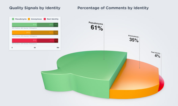
This graphic by commenting platform DISQUS, arguing that higher quality online discussions come from those using pseudonyms, splits the percentage of comments by identity into pseudonyms, anonymous, and real names. Is it a bubble chart? A pie? A coincidental bowl of jello? Actually, it looks like the height of each section represents the three values, so it’s a misshapened bar chart of sorts. Oi.
It’s trying so hard to look good that it comes across clunky and awkward.
If anything, they should have focused on the quality signals data on the left. Wouldn’t that have been more interesting? Have at it in the comments.
[DISQUS via @miguelrios]
 Visualize This: The FlowingData Guide to Design, Visualization, and Statistics (2nd Edition)
Ack. The cardinal rule—never use two dimensions (or in this case, three!) to represent a one-dimensional data set.
Is it just me or have they also messed up the quality signals data? The “Positive” (left) and “Neutral” (middle) bar widths for Pseudonyms and Real Ids look exactly the same despite the former being 61%/28% and the latter being 51%/40%
Yeah, the Positive value (61%) on the Pseudonyms bar should be almost twice the size of the Positive value (34%) on the Anonymous bar.
That’s bugging me way more than it should. If you look at the 0 – 50 -100 scale at the bottom, it’s clear that both the 61% and 51% are wrong.
I’m also bothered by the color selections: green (go, safe, good), yellow (caution), red (danger, stop).
At first glance it looks pretty, real pretty… But when you start deciphering the message, it all goes wrong. All they’ve ended up with is a good case study example of how to present simple data badly. Take away the over-complicated step effect and you have a perfectly helpful diagram.
If anyone talks about how this gets in the way of “serious analysis” of a 3 point data set I’m gonna scream…
What’s the big problem? You’ve got an interesting data set with some depth, on the left, which they represent with tools suitable for aiding analysis.
Then you’ve got a very very simple data set, on the right, which has a message they want to make eye catching and memorable. So they use an image that’s eye catching and memorable. Is the data set “61%, 35%, 4%” really something you need precise bar charts or powerful visualisation tools to make sense of it?
The image on the right is basically just an illustration. They could have used a stock photo, or a cute drawing of an angry furry troll bashing a keyboard while wearing a false moustache and glasses, but in this case, they used an image which carries (inexactly but eye-catchingly) a message that draws your attention to that 3 point data set, printed above.
It’s not a great graphic, but it works as a visual hierachy. The big, crude but eye catching image draws the eye in, and communicates a simple (but interesting) message. Then the 3 data points give you all the detail you need about this very simple data. Then, once your interest has been established, your eye is drawn to the chart on the left, which requires a little more thought – but that’s fine, because your interest has already been established.
So where’s the harm? Unless you’re worried that your clients will say “Design me something like this!” – but surely you’re capable of explaining to them why this style isn’t suitable for other purposes?
(I’m assuming this graphic is intended for drawing in a casual, uncommitted audience. If it was part of a serious report intended for specialists or industry people then yes, it’s completely inappropriate)
I tend to agree with Al. Not sure I would have done the same thing, but it gets the general idea across. It does seem to be more illustrative than trying to be super technical. I think the heights are proportionally right – or close to it. It did confuse me slightly that it seems to simultaneously try to be a pie and bar chart but I got the general idea and it didn’t distract from the main message that much. At least it’s clean and simple- I hate the overly cluttered charts that are more confusing than helpful.
Yeah, the jello chart is only a three point data set, you’re right – ugly, doesn’t help convey the data but doesn’t hurt it either. The greater transgression was belittling (and misrepresenting an a way only exceeded by Fox News – see the length of the 51% and 61% bars) the comment quality metric.
They really had 12 data points (9 quality metrics and 3 size metrics). A more comprehensive approach could have better conveyed how the comment quality varies among the commenter types, how the size of the commenter types varies, and finally combining the two to see how comment quality varies across all the comments (currently not represented).
At least they got some publicity for their chart
This thing is really making the rounds. Someone e-mailed it to me yesterday. I have to admit it induced dizziness.
They could have improved it by making each section into a pie chart representing the positive neutral, and negative sections. That would be wonderful.
Granted, that is a terrible chart. But if you have to use it to understand the difference between those 3 numbers, you have bigger problems. So I sort of agree with Al’s comments above.
I do, however, really like the character icons at the bottom of the full infographic:
http://mediacdn.disqus.com/1325732276/img/marketing/research/infographic_lg.jpg
Cute! :)
How is “logging in with facetube” =! “using a real identity”? At least the Germany based facebook community seems to be using pseudonyms on facebook already, myself included. Is the English-speaking world behaving differently?
There’s something very familiar about it….
http://img.dooyoo.co.uk/GB_EN/orig/0/7/0/2/5/702557.jpg