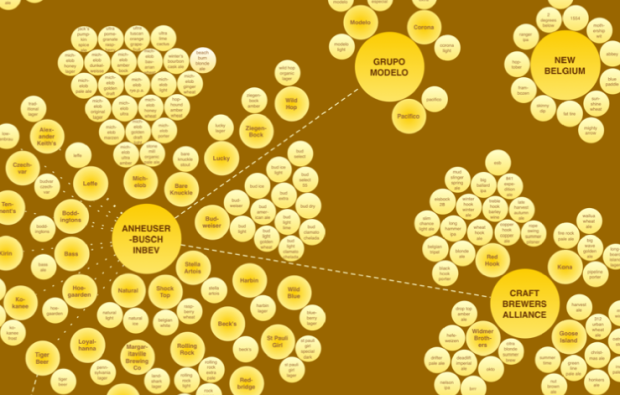
When you walk the beer aisle at the grocery store, there are lots of different brands and types, so it can be easy to think that all of those beverages come from different companies. Maybe you felt like supporting the little guy by buying that beer that looks like it came from a smaller brewery; however, you just might be buying from one of the big guys. In a follow-up to the soda structure map, Phil Howard and Ginger Ogilvie map the structure of the top 13 beer companies.
AB InBev owns, co-owns or distributes more than 36 brands, for example, while MillerCoors controls at least 24 more. MillerCoors also brews Metropoulos & Company’s products under contract (thus the company that controls Pabst and 21 other brands is a “virtual” beer company).
Stella Artois, Beck’s, and St. Pauli Girl: owned by AB InBev. Or how about Dos Equis, New Castle, and Amstel? Those are owned by Heineken, which is partially owned by Tiger Beer, which in turn distributed by AB InBev. Yep.
Check out the high-resolution version and other breakdowns here. Any surprises?
[Who Owns Brew | Thanks, Phil]


Presumably they mean “all the major beer companies in the US”?
Hello from the rest of the world. (waves)
If beer is a topic that interests you, I suggest you rent ‘Beer War’ on NetFlix. It explains how the big corporation took over the beer market and how hard it is for small brewery to sale their products. Quite good!
AB Inbev actually has its HQ in Belgium, Heineken is Dutch
so I do believe it’s not only limited to the America’s
The graphic doesn’t really communicate market share very well and that to me is more important than the relationships.
Doug,
On the source website is the following graphic, on the same page as the one listed here:
https://www.msu.edu/~howardp/beersharezoom.html
I think the image here communicates ownership very well, whereas the market share graphic does its job well. Perhaps color-coding the market share graphic by owner could communicate both well.
That graphic is better.
I would say it is a start. The visualization is not very good and incomplete, and that would be good to have in fact the data. It’s not clear where they are coming from. Sapporo in Japan for example is missing (Sapporo for example owns Sleeman). I wonder if a Sankey diagram on a timeline would not be better showing the take-overs.
Now map who owns the wine. Gallo = Gallo, Barefoot, etc.
Reminds me of how many of the web hosting companies are owned by Endurance International Group. That might be a worthy topic of another one of these explorations…