Jer Thorp, who has a knack for creating stuff that’s both useful and beautiful, continues his string of impressive work with this visualization for Boing Boing (video below). It shows possibly habitable planets, according to Kepler data. For those unfamiliar, the Kepler mission is to find possible habitable planets, or more precisely:
The challenge now is to find terrestrial planets (i.e., those one half to twice the size of the Earth), especially those in the habitable zone of their stars where liquid water and possibly life might exist.
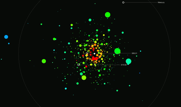
The visualization imagines if all the exoplanets were orbiting a single star, which is physically impossible, but allows for comparisons for size, temperature, and path. There are a few views, starting with the exoplanets orbiting and then the animation transitions to something that sort of looks like an exoplanet mountain and then into a bubble plot.


Lee Billings writes:
Important data trends prominently emerge from this visualization. The abundance of smaller candidates and relative sparsity of larger ones clearly indicates that there are many tiny, meek worlds for every giant planet. But curiously there is a relatively stark drop-off in the frequency of Kepler candidates at or below approximately Earth-size. My gut says this is probably an observational bias that later data releases will smooth out, but perhaps it’s not, and Mother Nature actually prefers slightly chubbier planetary progeny, with Earth being a slender outlier.
That said, the part that will really rock your socks off is the transitions. Enjoy the short video below:
P.S. For all of those wondering how it was made — it was done in Processing, but Thorp notes: “I’ll try to release a .JS version of the exploratory Kepler visualization featured on @boingboing – there will definitely be a code release.”
P.S.S. He also hosts workshops for Processing and data visualization.
[via]
 Visualize This: The FlowingData Guide to Design, Visualization, and Statistics (2nd Edition)